Welcome! I’m Pedro, and this is my website, where I show myself as a product designer.
To pan around, try
- Tap + Drag
To zoom in and out
- Scroll / Pinch

Welcome! I’m Pedro, and this is my website, where I show myself as a product designer.
To pan around, try
To zoom in and out
Pedro MC Fernandes
Product Designer
Lisbon, Portugal
Website designed, illustrated and assembled by me, with the help of GPT-4, using my script font, Lexend, Astro, panzoom, Tippy.js, mark.js, Lozad.js, and jsPlumb Community.
Unless otherwise stated,
Copyright, Pedro MC Fernandes
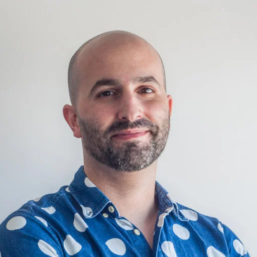
My name is Pedro MC Fernandes. I can start by saying I’m a creative person, and I love the art world. I enjoy digging that scene, getting inspired, doing random stuff on sketchbooks, exploring, being creative.
I currently work as a product designer in tech. I have a lot of design experience in several industries, more recently with digital products.
But more importantly, I’m a family man and love spending as much time as possible with my partner and daughter — nothing beats that.
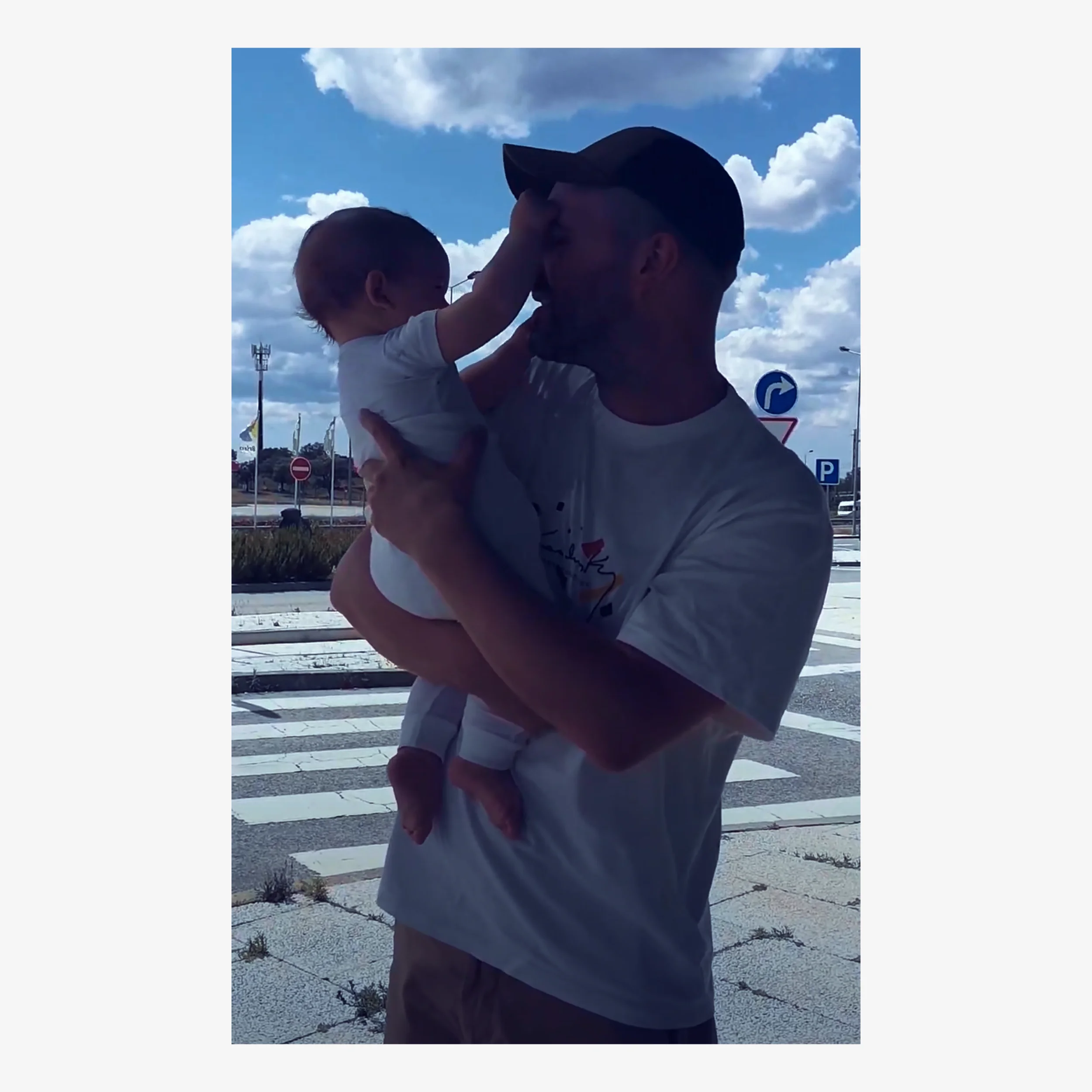
If you get to know me, you’ll see I’m shy at first, but if you’re patient enough, you’ll get to know me and my lousy puns!
It isn’t easy to separate. It’s always the same person, right? There are no illusions here; work is necessary today. I tend to become too enthralled with ideas. The excitement of getting into a new idea pulls me in very quickly.
To be focused on what matters, I go outside to breathe fresh air, spend time with the family, drink the occasional warm beverage, and listen to tranquil music.

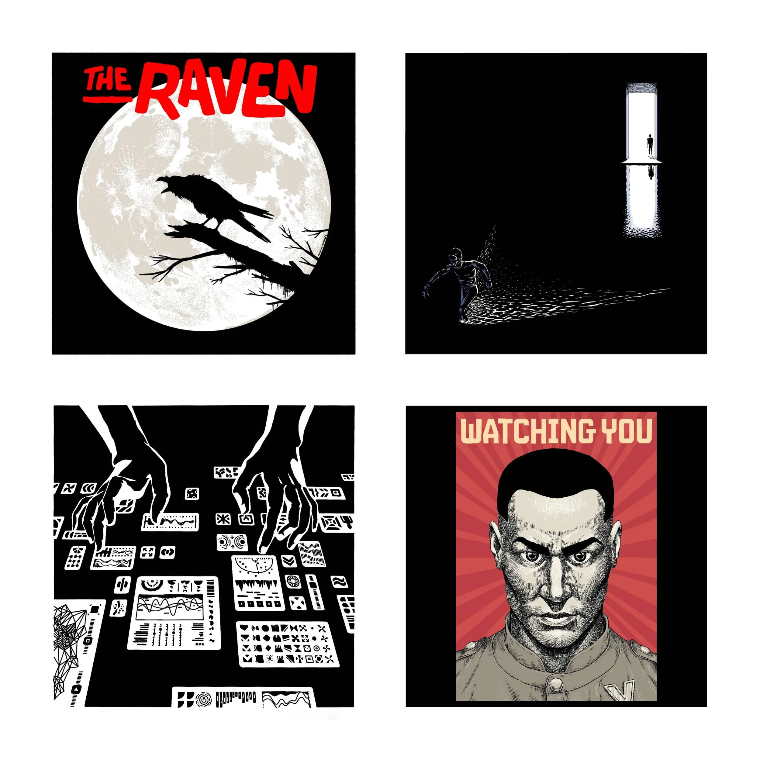
I also dedicate some time to art projects that help me de-stress. I like creating stories and experimental narratives through comic book art.
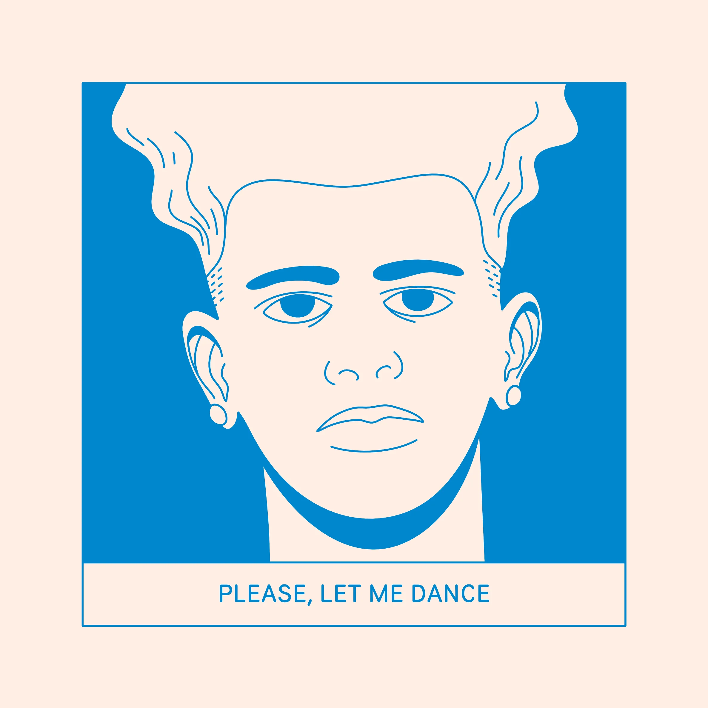
I’m focused on being a more efficient communicator. In any context, really: family, neighborhood, work, grocery store, anywhere. I try to listen carefully to others to understand them more and empathize with their feelings.
I feel that’s the most important value for a good life and a better relationship with others. Not only in avoiding conflicts but as a way to grow and live healthier. Peace is underrated.
I look into what I am today. I don’t look much into my future self, so I don’t plan my personal life per se. There are way too many variables to control. I bet on self-assessments to learn from my mistakes and maybe look for a few areas of improvement.
I see myself with my partner helping my daughter grow, be her best friend, and help her thrive and do her best in her community.
Can’t-restrict-to-just-one cliché. I prefer comic books. They’re very relaxing. I like Jaime Hernandez, Ulli Lust, Olivier Schrauwen, Maria Medem, Nick Drnaso, and many others.
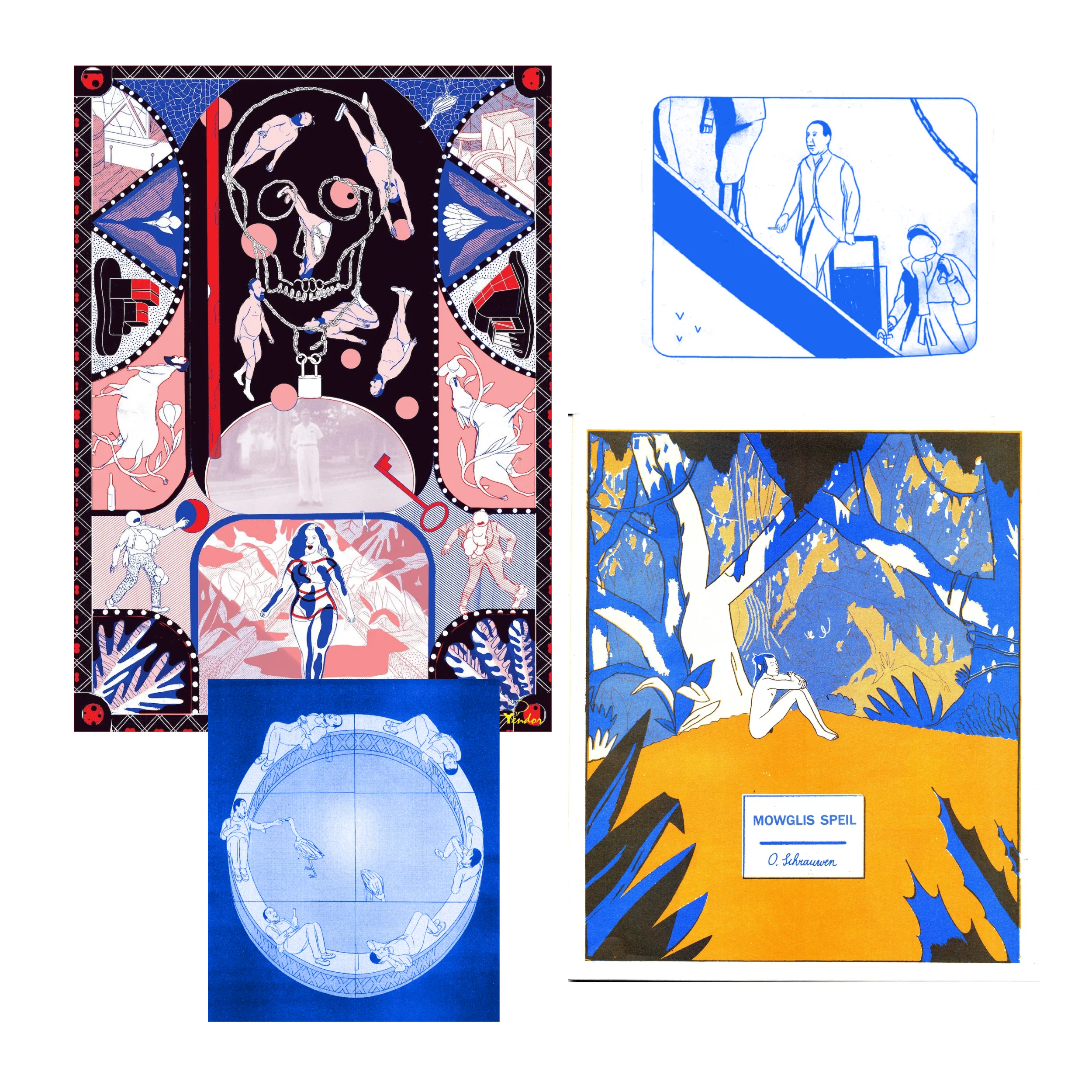
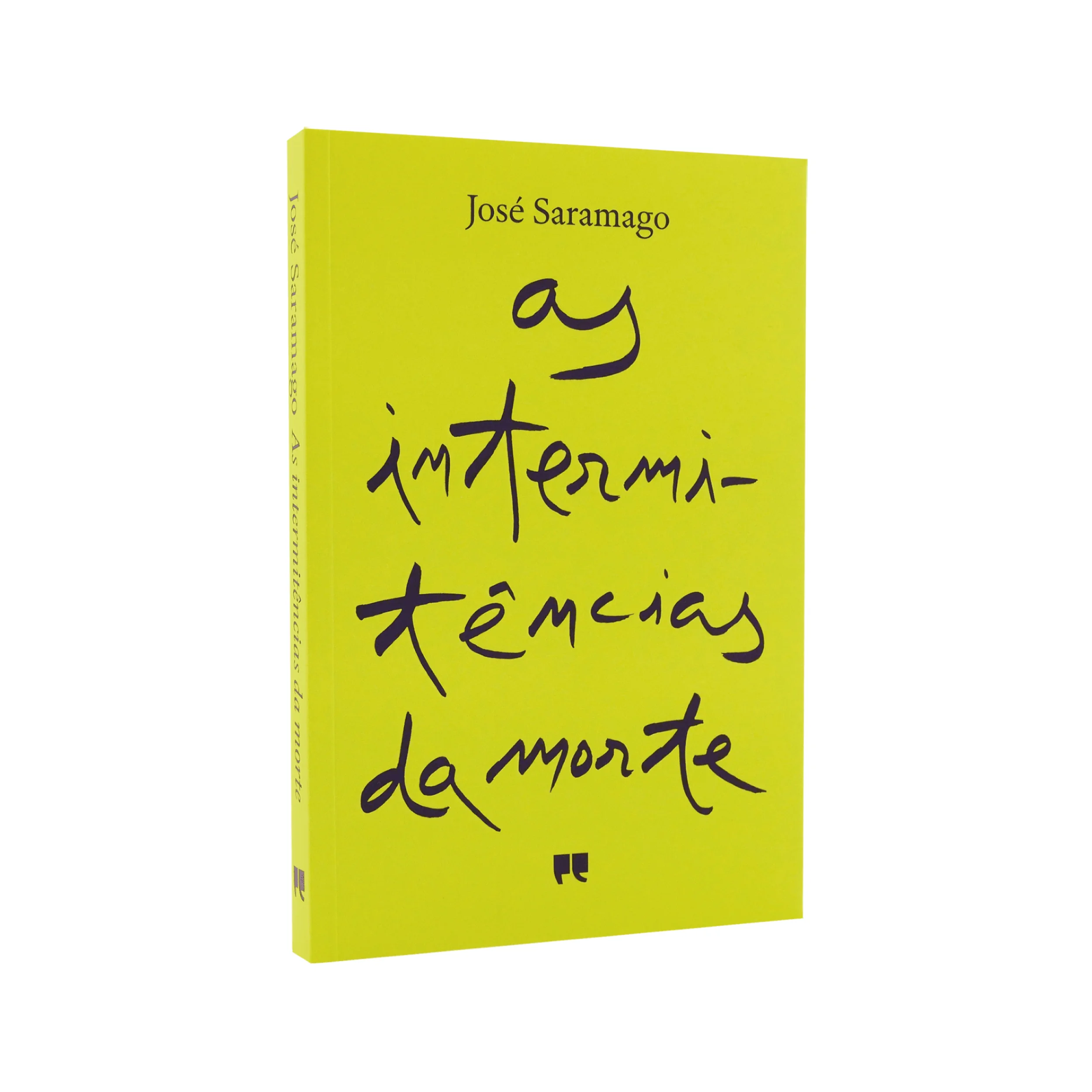
On the prose side, I don’t read much, but I loved reading “Death with Interruptions” by José Saramago. Also liked Stanisław Lem, George Orwell, and Dostoevsky.
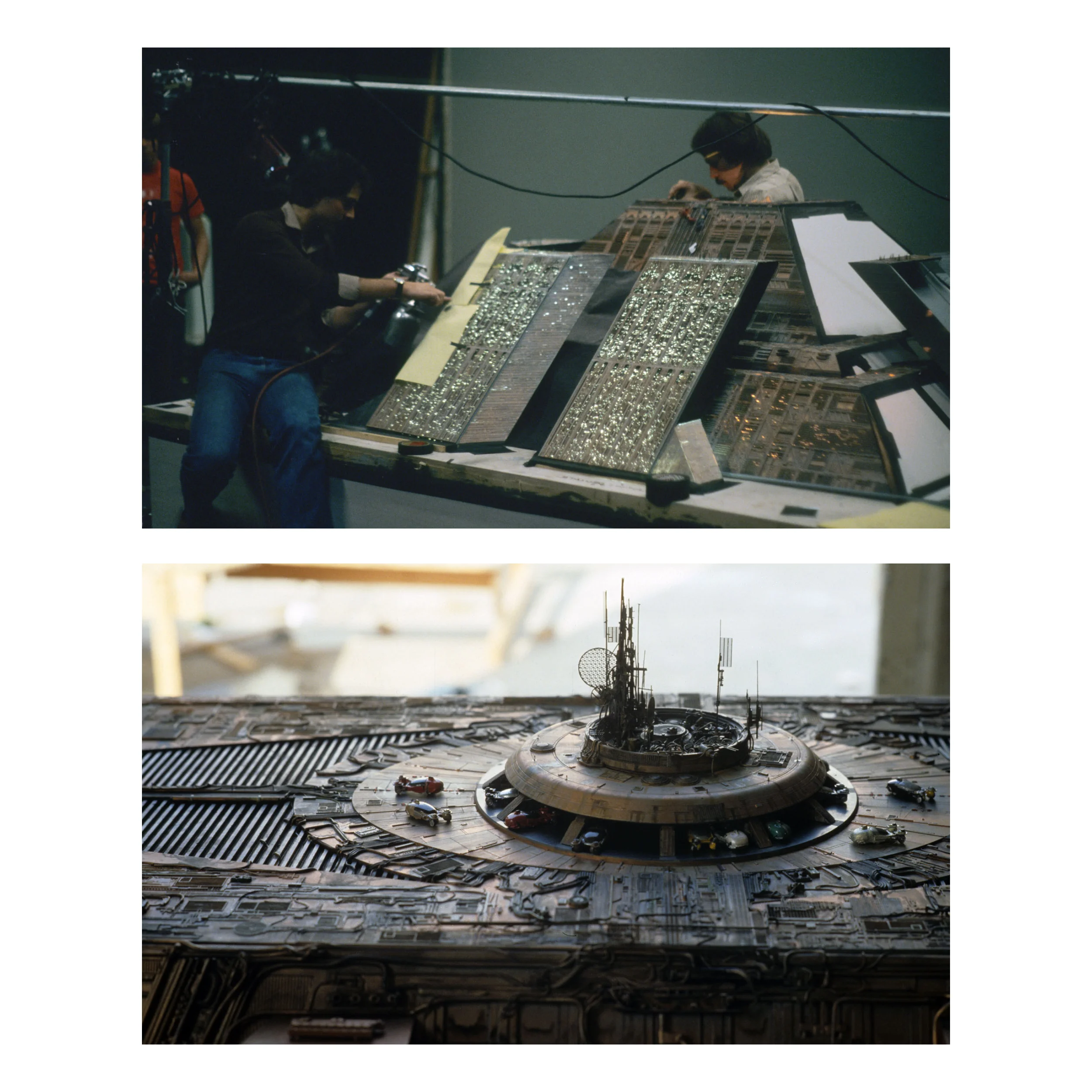
1982 “Blade Runner” often comes to mind. It’s not perfect, but I love it on every watch. I enjoy their original ambition to craft it and its resulting plasticity and darkness. It may seem scrappy nowadays, but it conveys deep feelings and poetry.
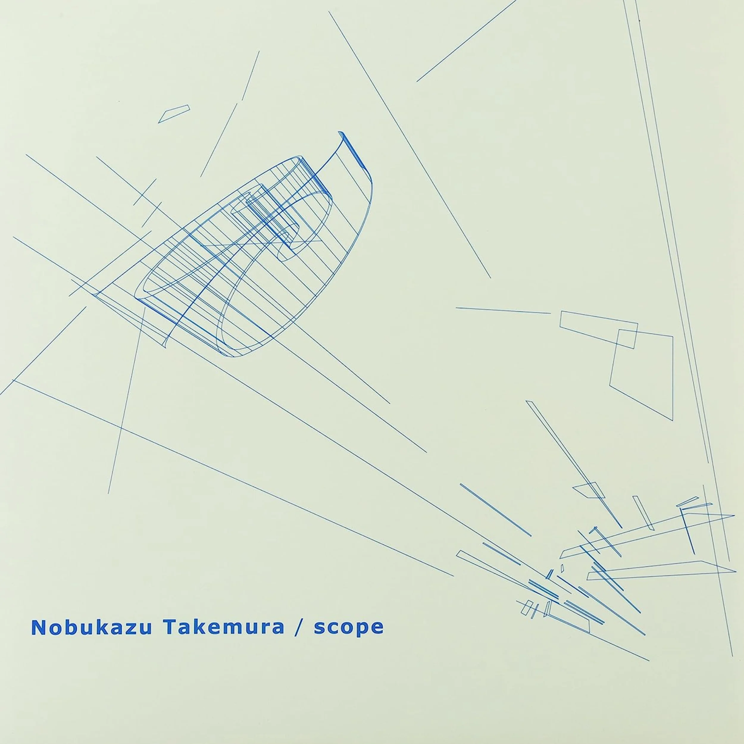
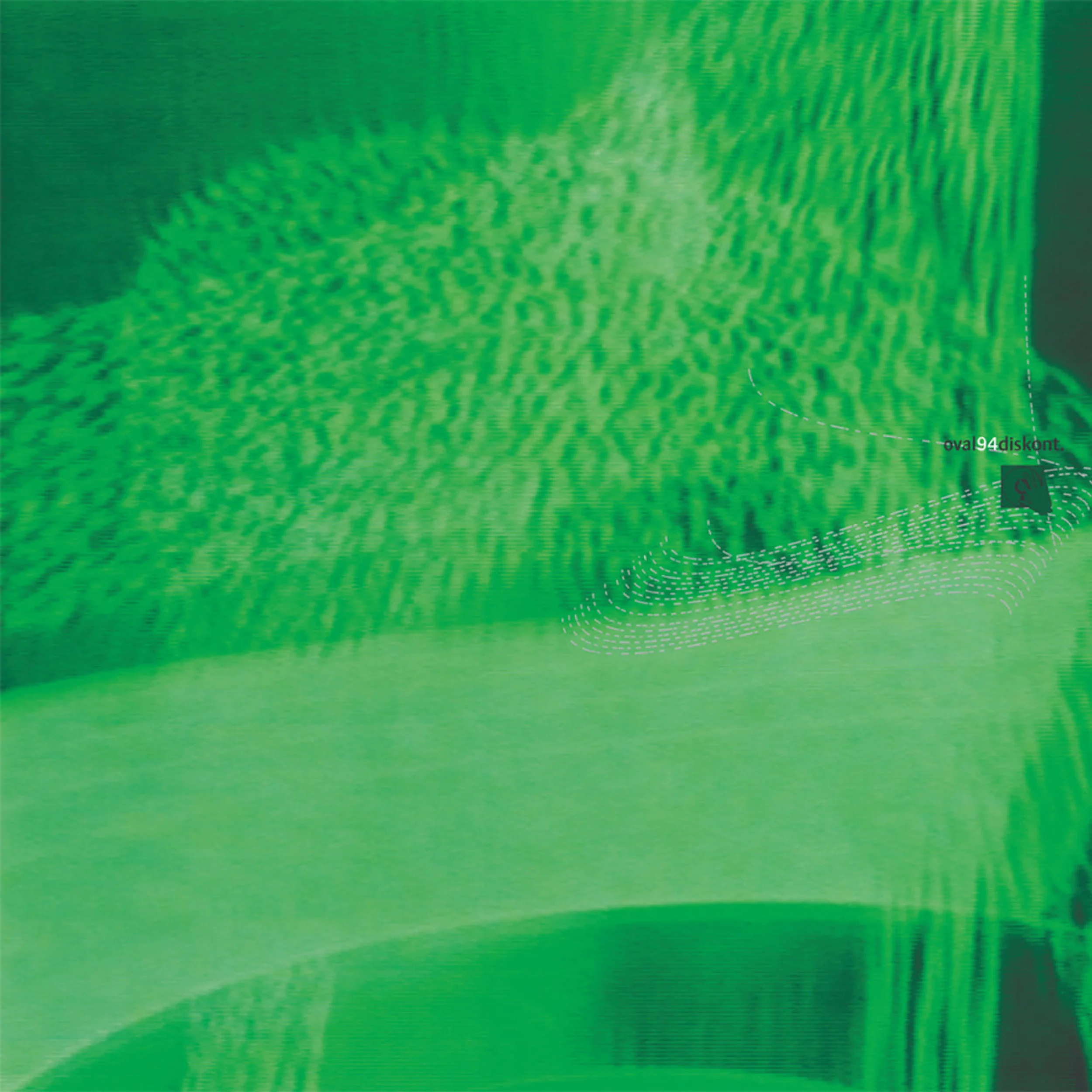
I have a shivering, trance-like experience whenever I listen to “Scope” by Nobukazu Takemura, “94 Diskont” by Oval, also Jon Hassell, Brian Eno, Cocteau Twins… The list could go on, but these names frequently come to mind.
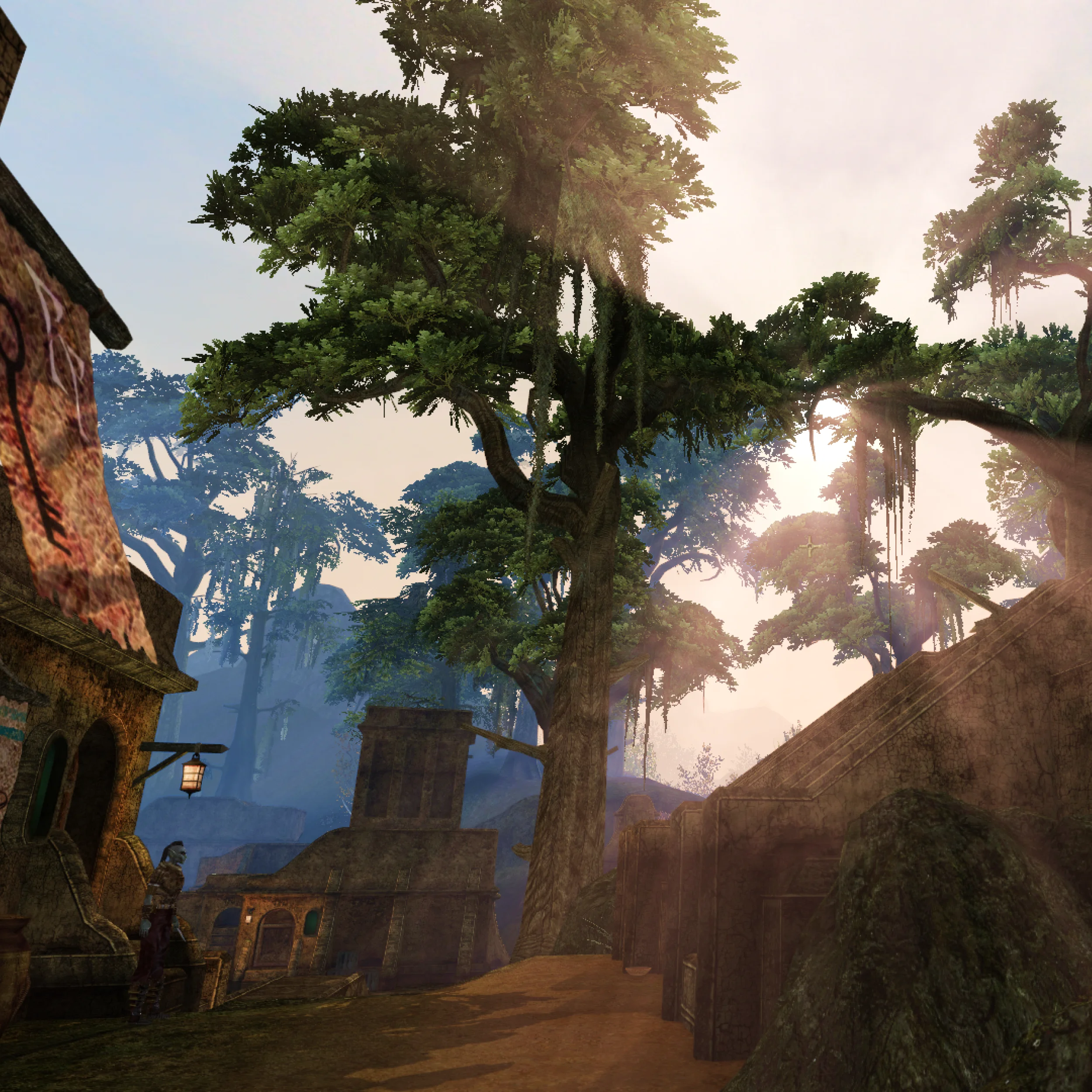
I played a lot of games as a teen and young adult… I enjoyed most of them. Morrowind impacted me due to the incredible atmosphere and design. I was just there to stroll around and visit new places, didn’t care about the missions!
I’m passionate about creativity. I love to create, break down problems, and have new ideas. I like discovering solutions and always get excited when they come up.
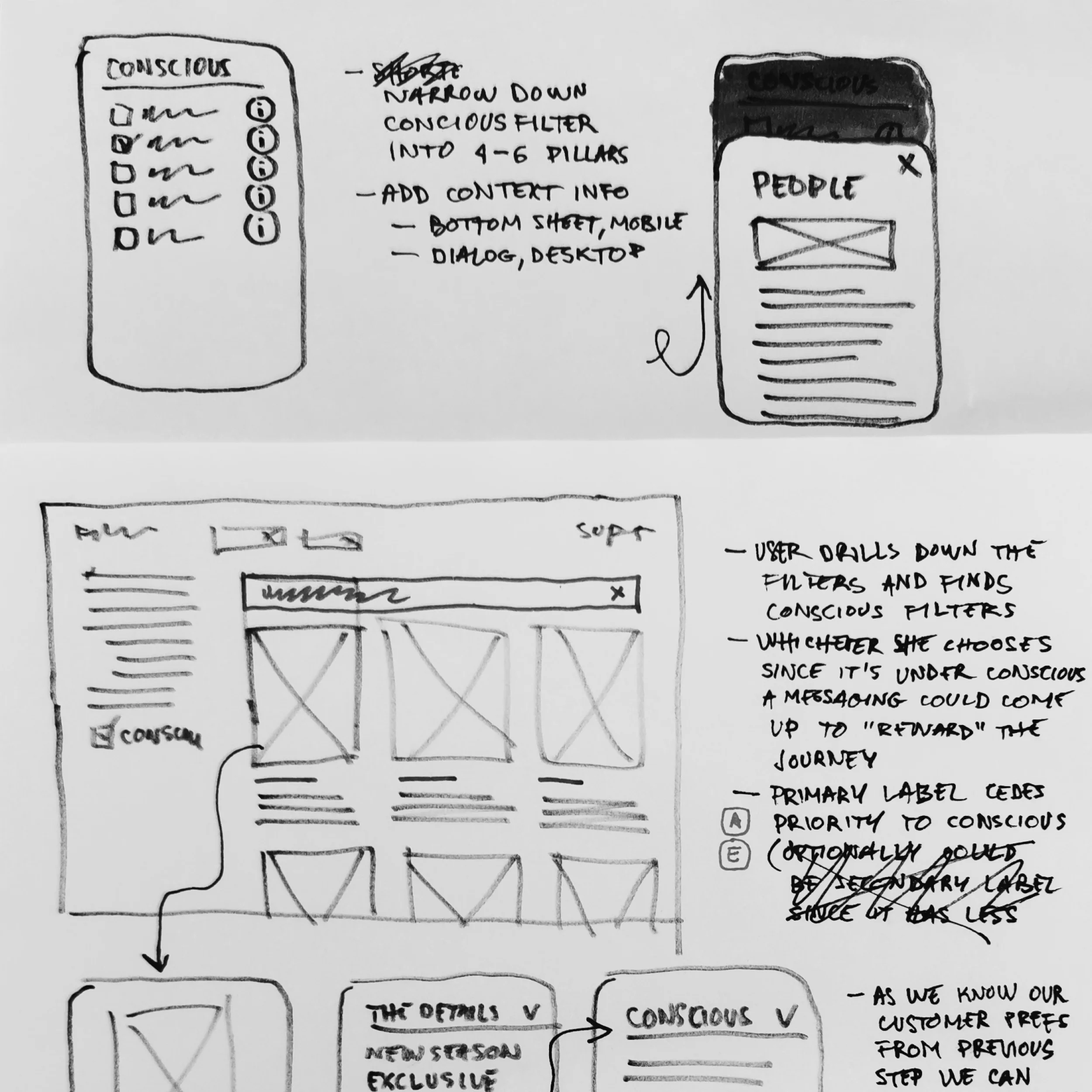
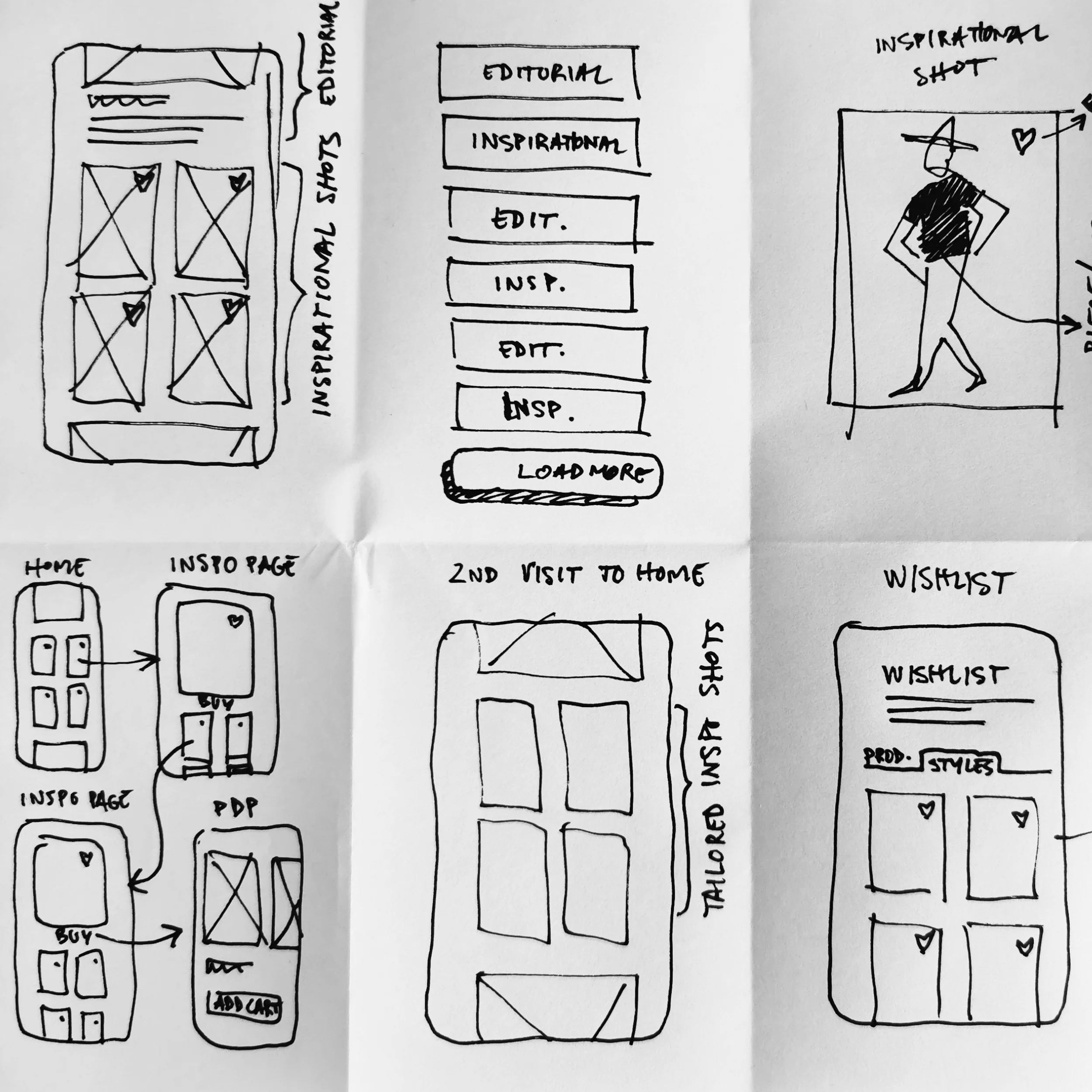
It’s also natural for me. I draw and sketch a lot, and that specific skill is helpful for design. It changes the way I think and how I approach problems. It forces me to focus on the visual outcome and is a more powerful communication tool with myself and others.
As a kid, set design inspired me a lot. Seeing 2001 Space Odyssey, Blade Runner, Star Wars, and many others made me think I could reinvent the world. One where we think, plan, and build something new, unique, and valuable, to make our lives better.
I started with industrial and architectural design but ended up in the digital world. We face a lot of unique challenges with contemporary technology. There are many opportunities for the present and a higher responsibility to guarantee the future. I believe I can help change things for the better.
I don’t look much into trends. Nowadays, they are empty of substance and filled with copycats. I prefer to take inspiration from daily routines, pay attention to my surroundings, read people’s expressions, and learn from communication patterns, body expressions, etc.
Staying connected to the present moment and deriving inspiration from daily life is my way of staying motivated. Activities like traveling, meeting others, absorbing different ways of doing things, and appreciating nature motivate me to change and discover new methodologies.
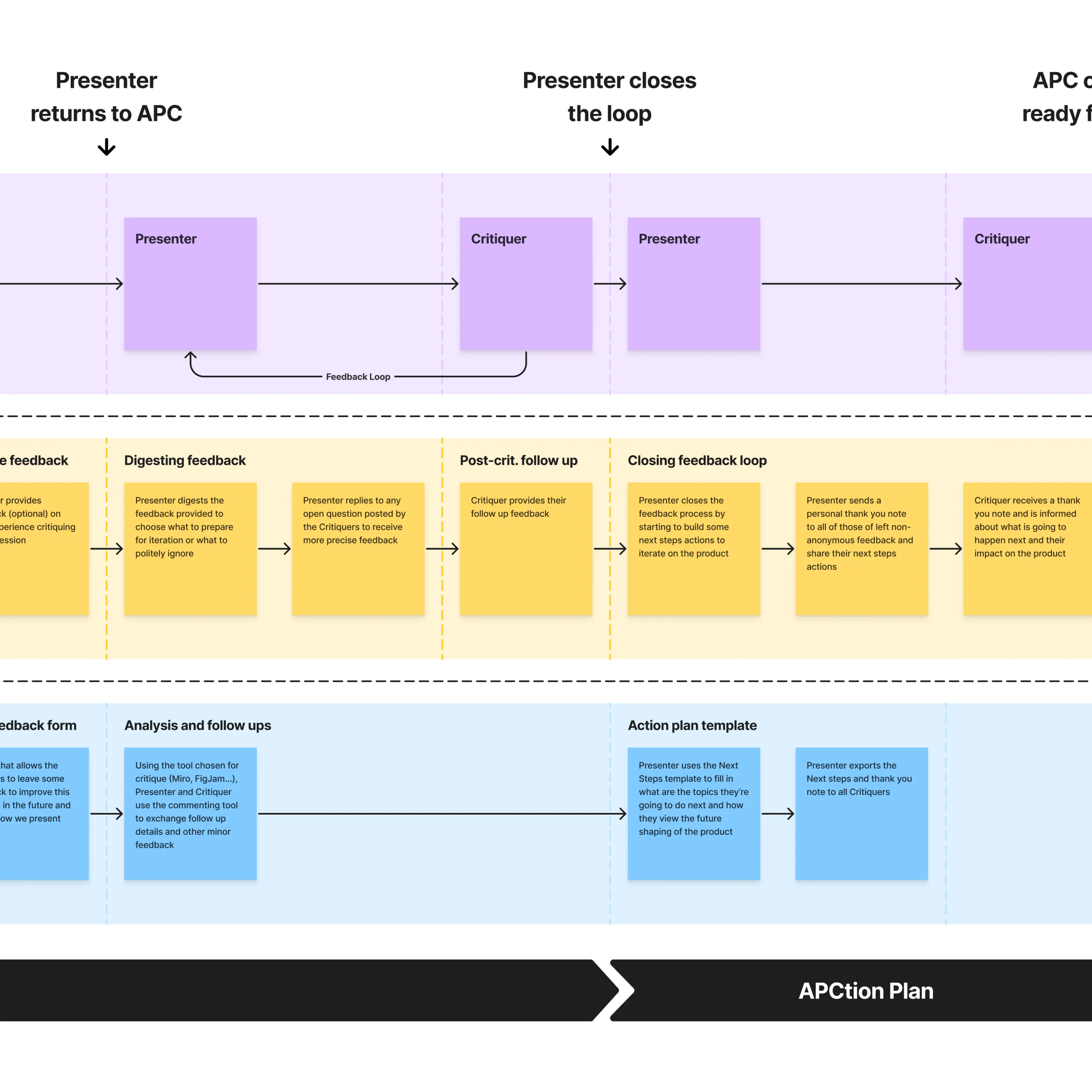
One challenge is keeping everyone involved and motivated to criticize and collaborate on designs. Sharing with other designers is easier, but often I need collaboration from other departments.
It works to introduce yourself, explain what you do (it’s obvious to you but not to others), explain the problem space, present the associated solutions, give time to digest, and ask for feedback. It’s not enough, and getting more involvement from others is essential.
I aim to work more on this and prove there’s a better way to co-create and collaborate in cross-functional teams. This is one of the growth areas I’m focused on right now.
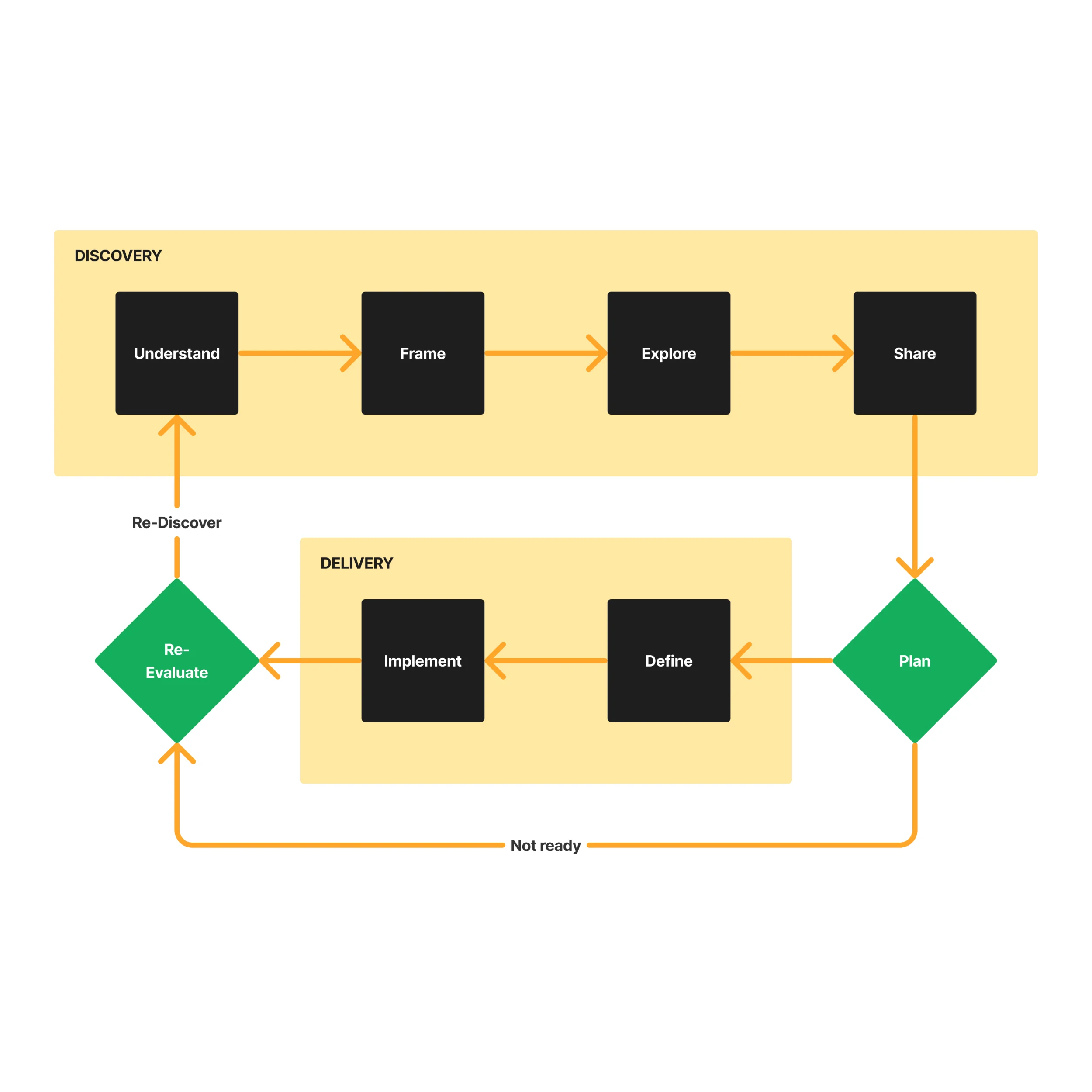
Ideally, I like to follow a documented process. I think it’s a gift we can strategize and create solutions methodically. I like to admire other methodologies, learn how they work, and use them where possible.
But going by the book is not always possible, so I improvise where needed. Having experience helps, and I can anticipate where we can cut corners. Different problems require different approaches, and I try to pay attention and be open to change for better outcomes.
Due to family needs and time constraints, I do my best to participate in events, but primarily online or I get async insights. I get news, tools, and techniques from LinkedIn, newsletters, and some key websites, but I don’t put too much pressure on it.
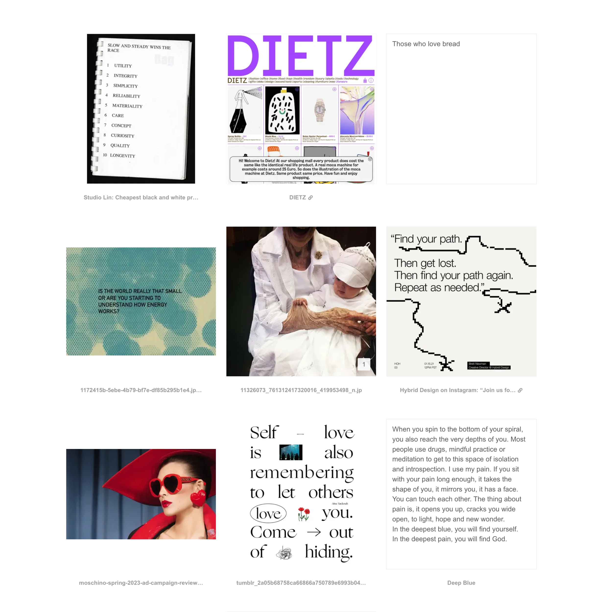
I don’t interact much with the design community. I watch and read from afar. I occasionally contribute to some communities that spark my interests and match my hobbies, like open-source, comic books, graphic design, illustration, radio, music, etc.
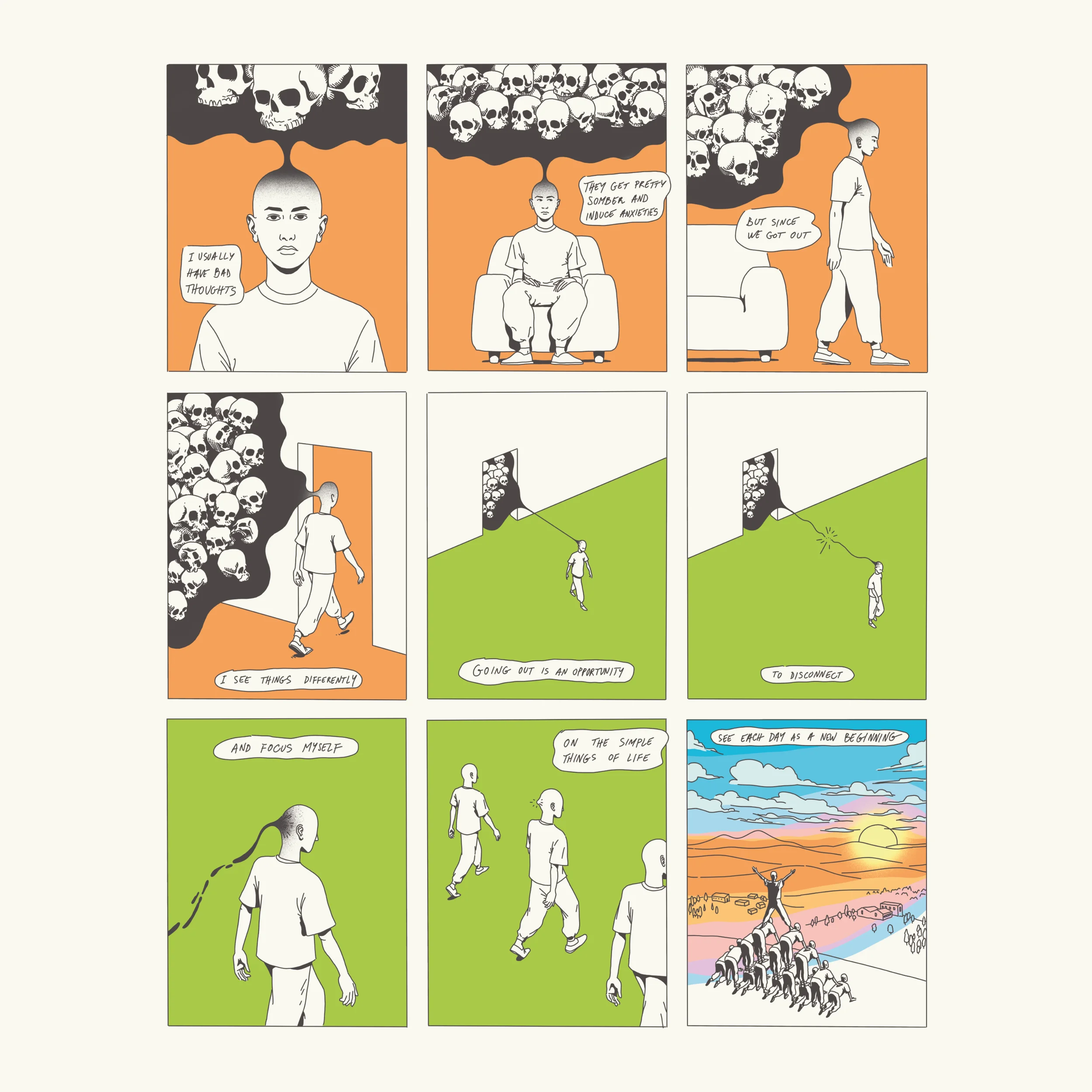

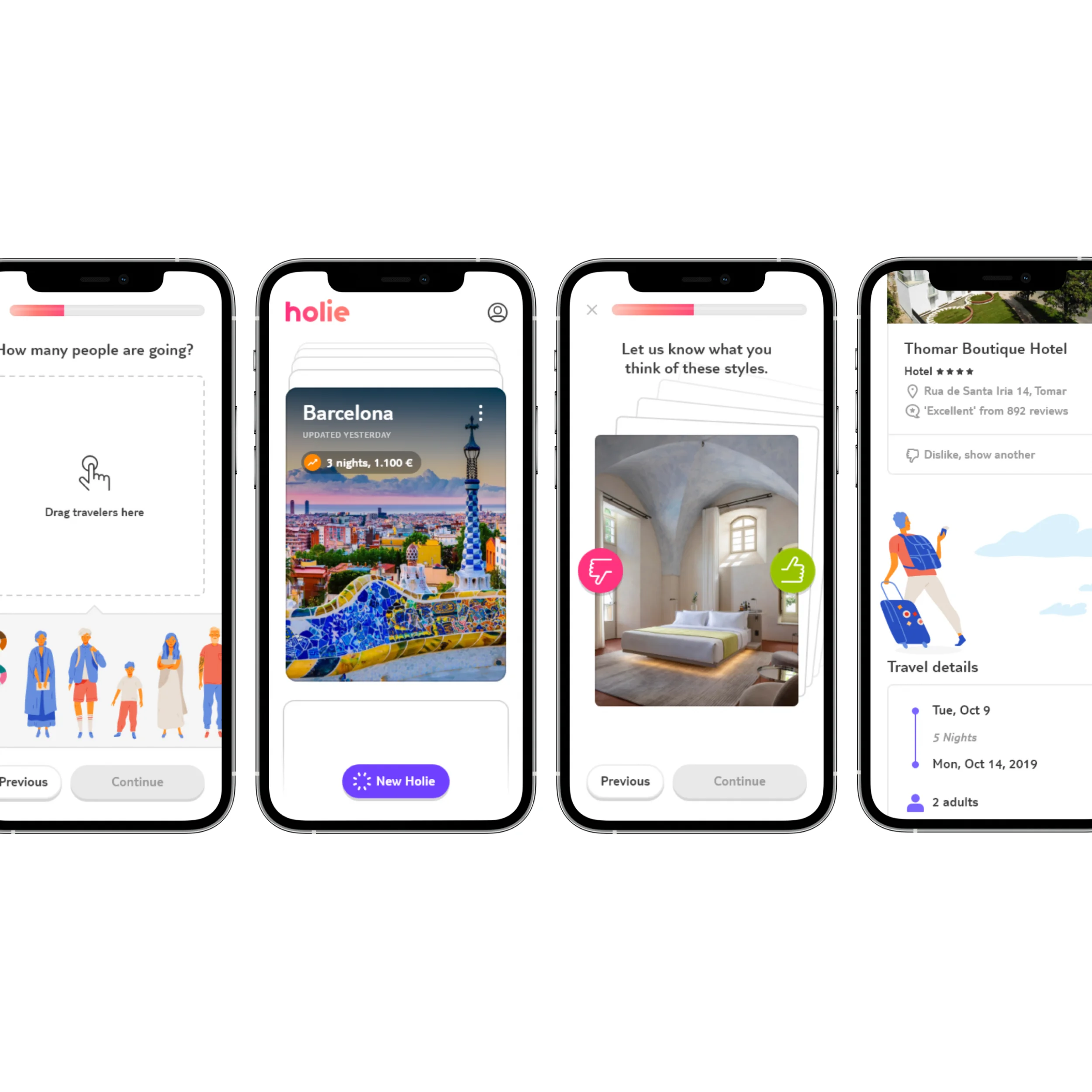
I’m obsessed with UI “perfection,” which leads me to put extra effort into conveying ideas accurately. It’s a blessing and a curse. There’s the risk of overdoing it.
The experience helps me control it. Taking breaks and switching tasks helps put a different perspective and reassess efforts. I’m happier with my current pace and how the results improve and come out with less effort with more maturity.
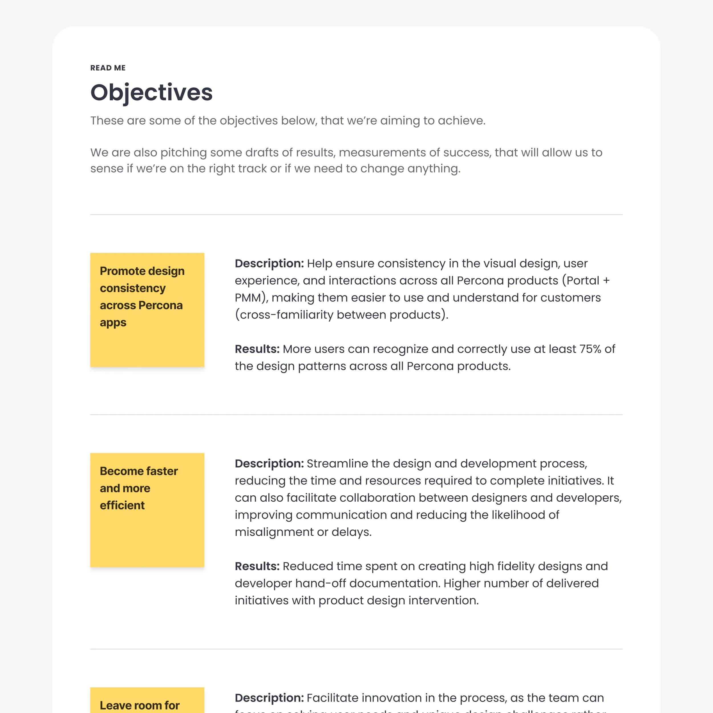
This extends to my modularization obsessions. I love optimizing my files, either designs, references, or code, so they are as centralized as possible to save me from repetitive work and iterate faster in the long run.
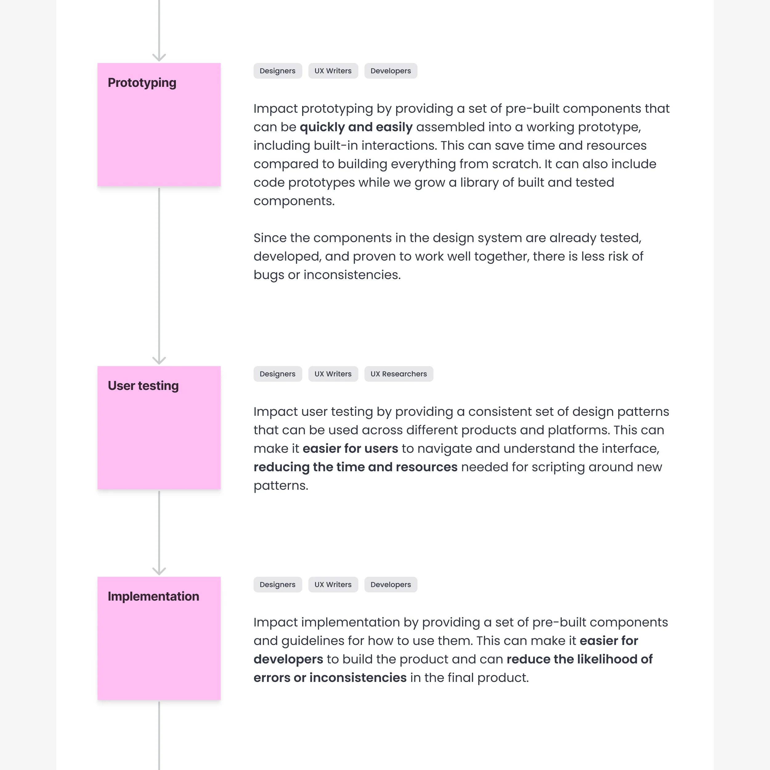
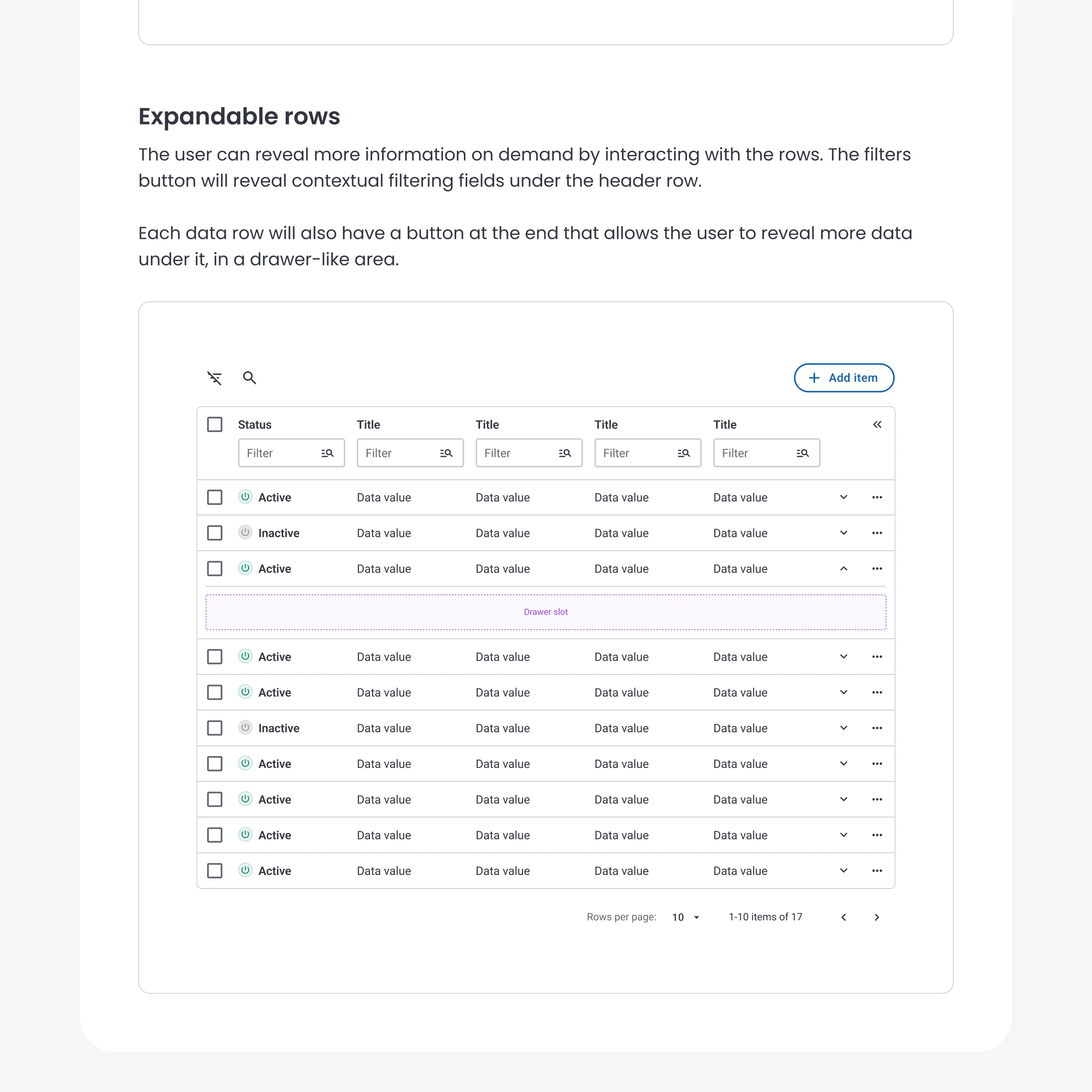
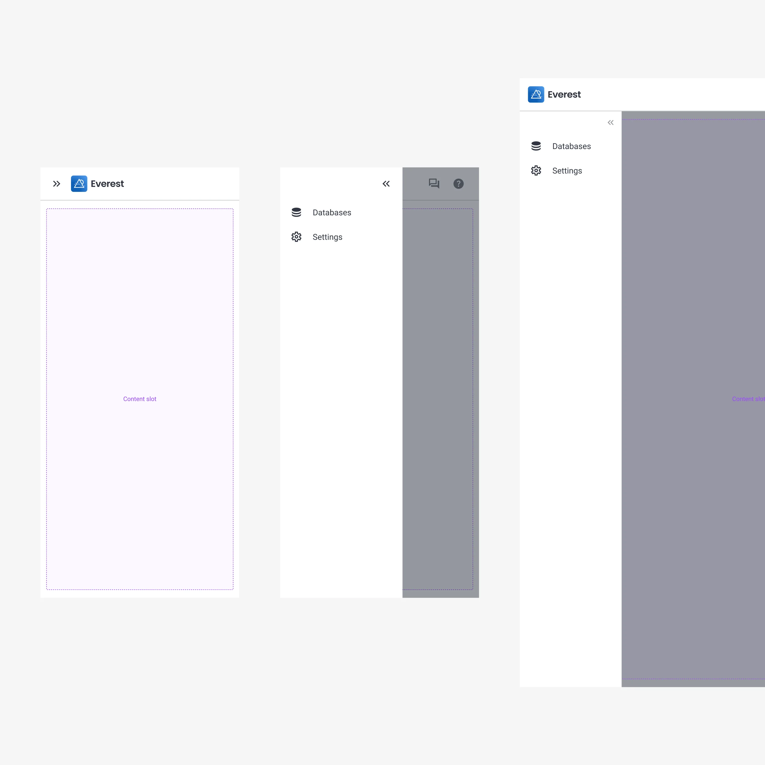
I also believe I’m a decent presenter. I’ve honed my skills for a while. I stopped stuttering, sweating profusely, and I no longer tremble, I think… Paired with “stunning” visuals… I can convince anyone my ideas are the best!
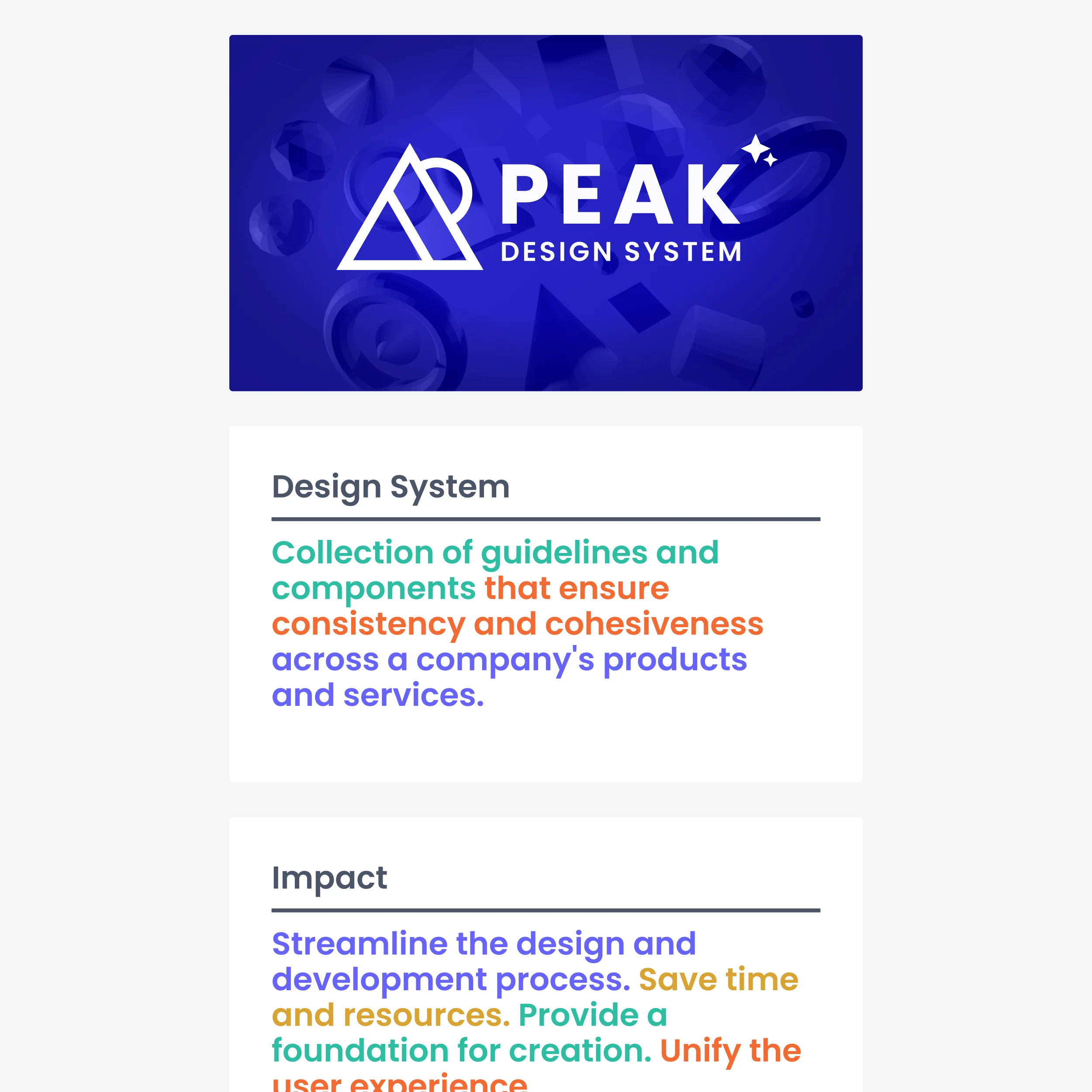
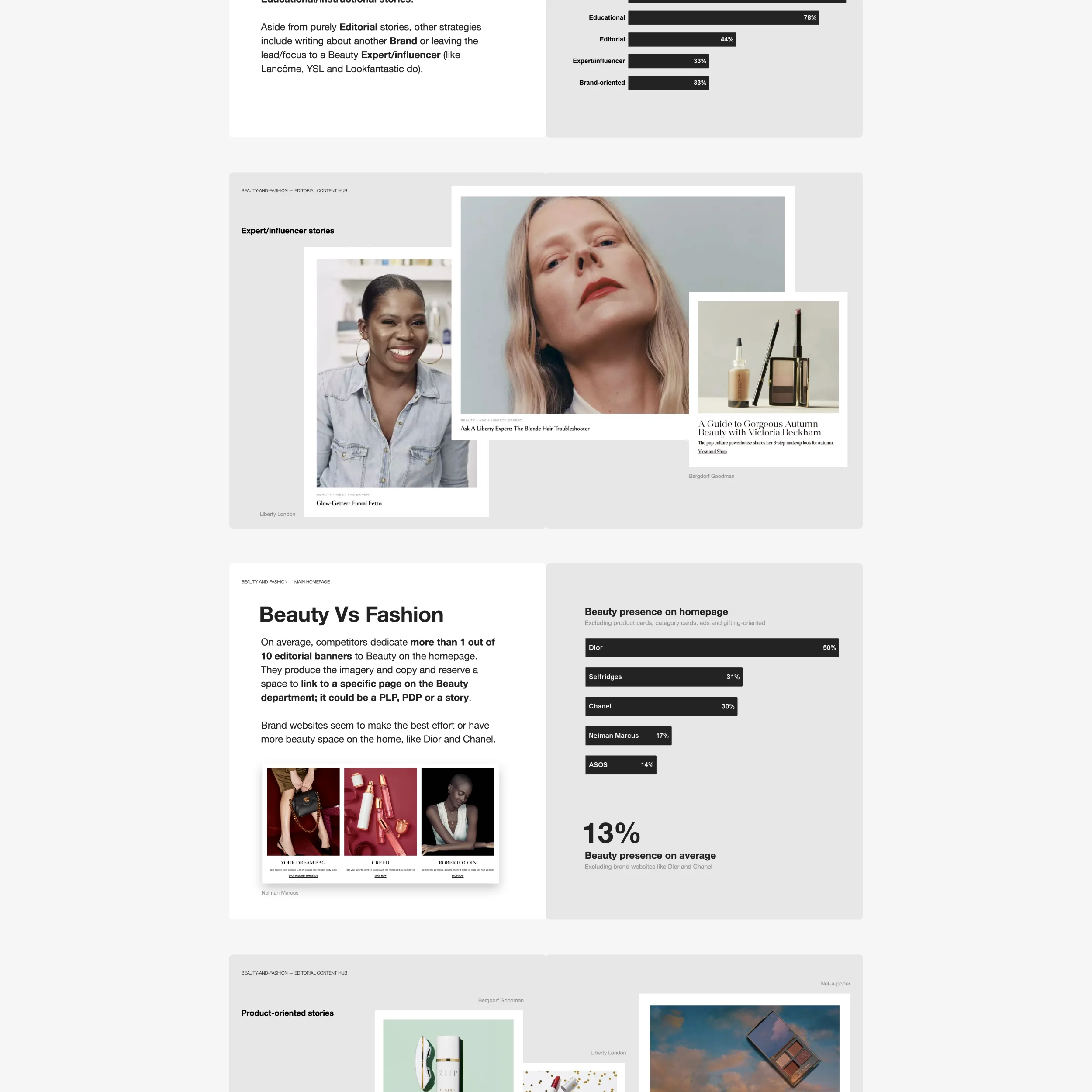
I see myself continuing to do good with my design skills. Learn to share, and collaborate better, more effectively. I want to help build a better world where creativity powers innovation.
A world where we have a better relationship with technology. One where everyone is invited and doesn’t feel excluded. One everyone can enjoy, enhance and grow their abilities and feel motivated to co-create.
I want to be involved in improving creative processes. I want to improve operations, empower a design culture within product teams, and to design products people love using.
I advise starting with a data-driven approach. To see what we have, I reach out to other departments or colleagues to get their points of view on the users/market and get empirical data. This usually leads to ideas on where or how to source more factual material or evidence.
I explain why and how we use the data, so everyone can be on the lookout for any changes or generate periodic reports interlinked to any ongoing problems. This data and reports will become handy once we change or launch a new product.
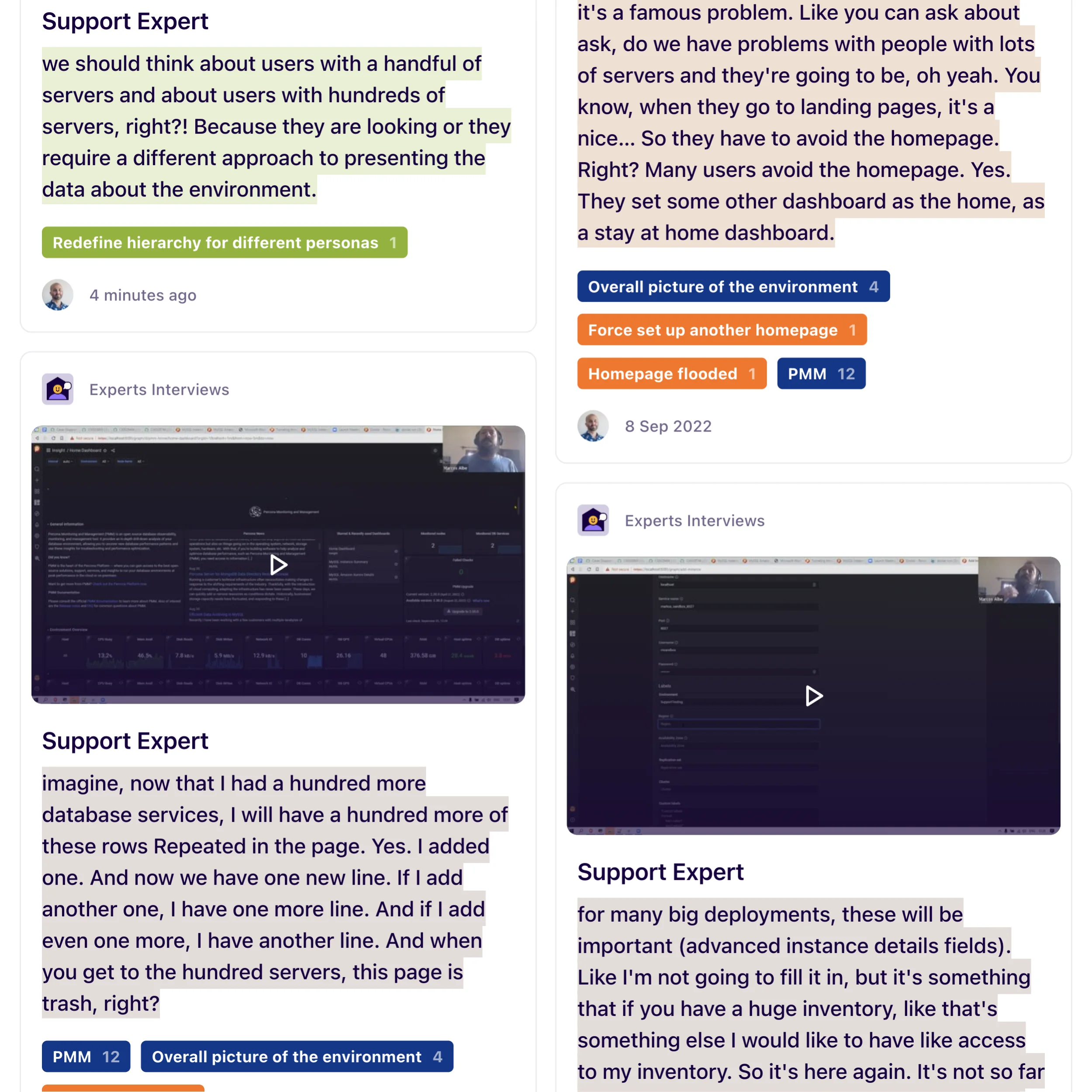
This would be the first step to approach the research phase. More is definitely needed, and we haven’t started to talk with potential users yet, which can be next.
We may need to go back to experts and users again to validate assumptions and tracking of success through interviews and tests. I usually map all collected information to facilitate the analysis of experts and stakeholders to have a shared understanding of our direction.
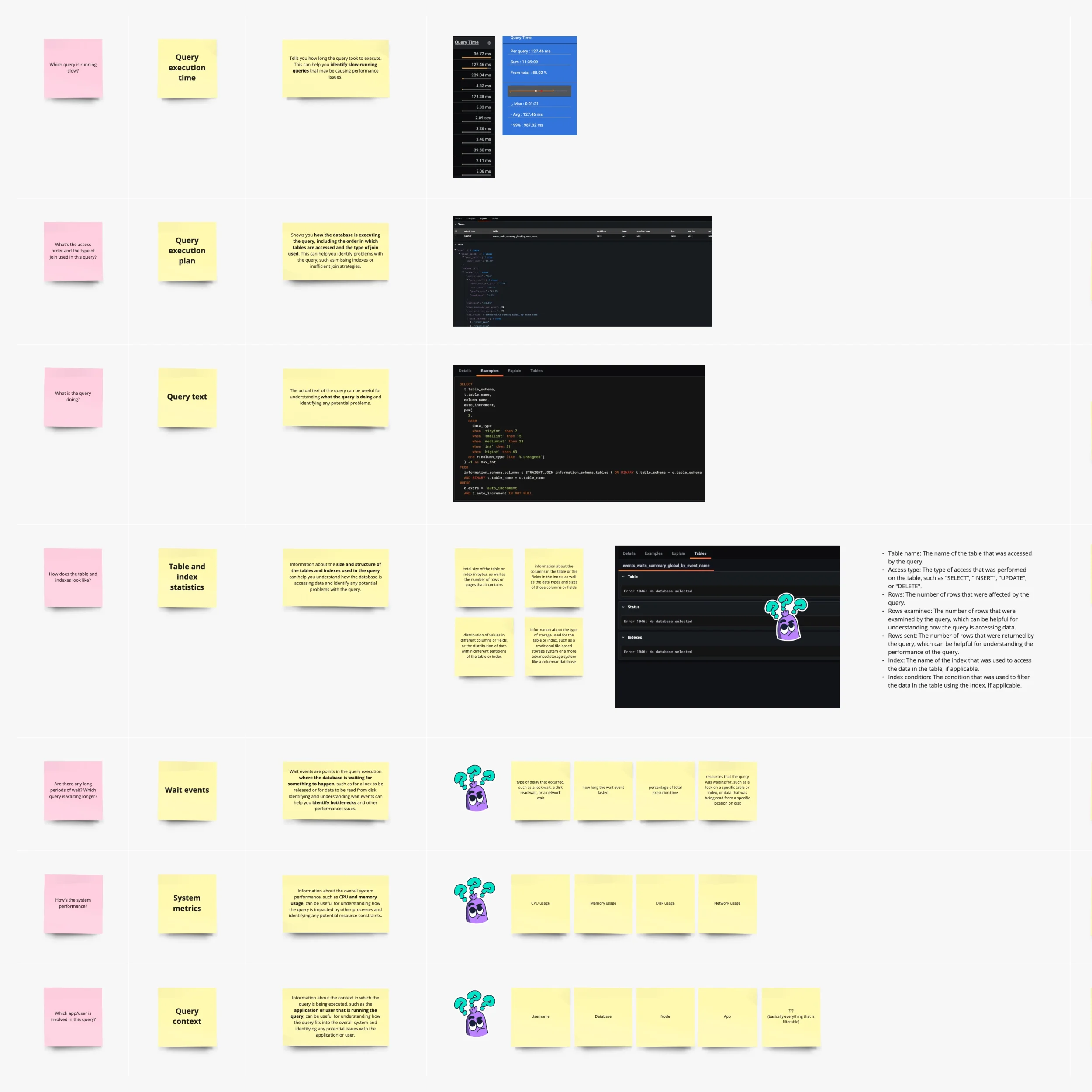
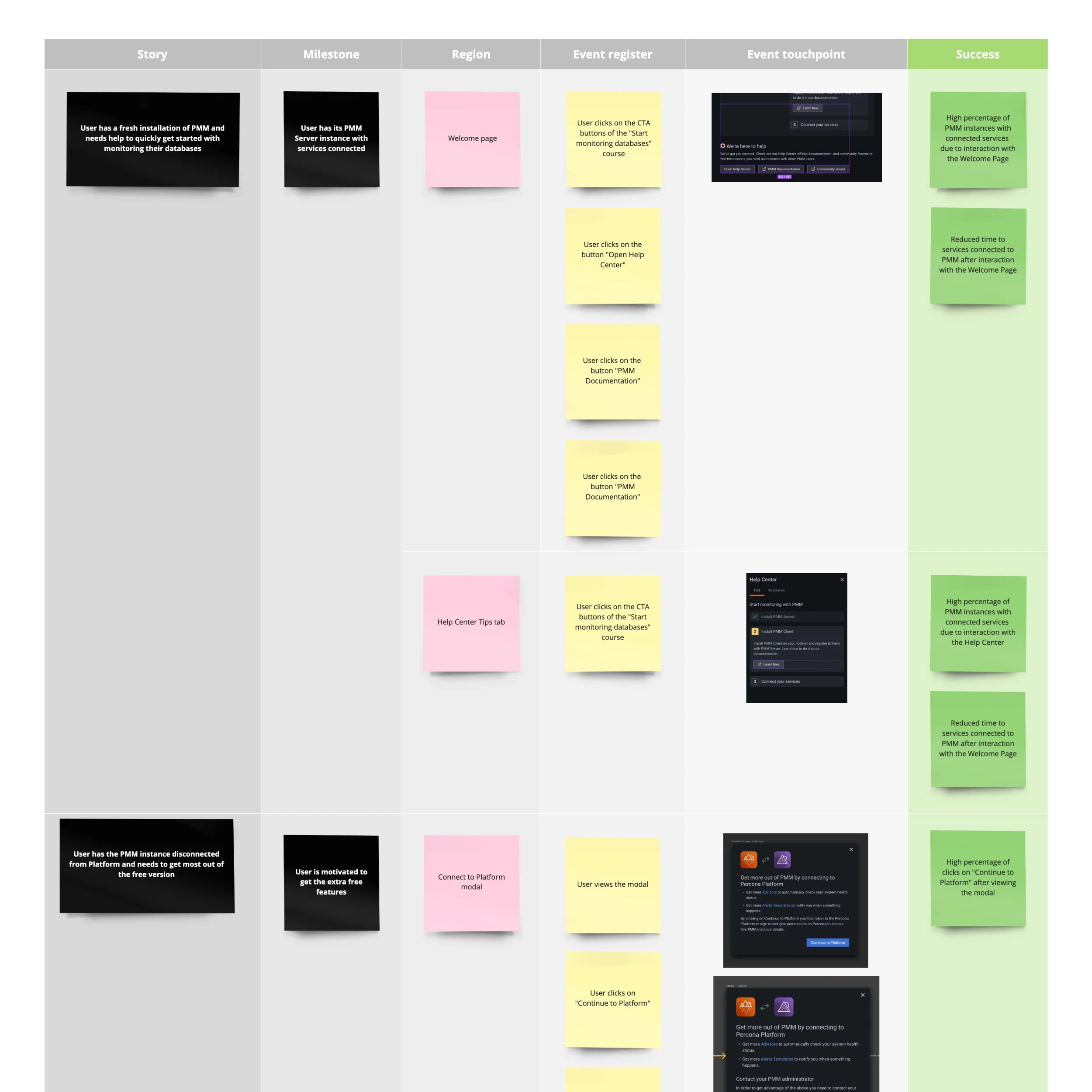
User research has been essential! I gain valuable insights, empathize with users, and understand their problems and needs, allowing me to create user-centered designs.
I can identify pain points, usability issues, and innovation opportunities. Interpreting the findings allows us to make more informed decisions and iterate confidently. We can reduce risk, increase the likelihood of success and provide a competitive advantage to the company.
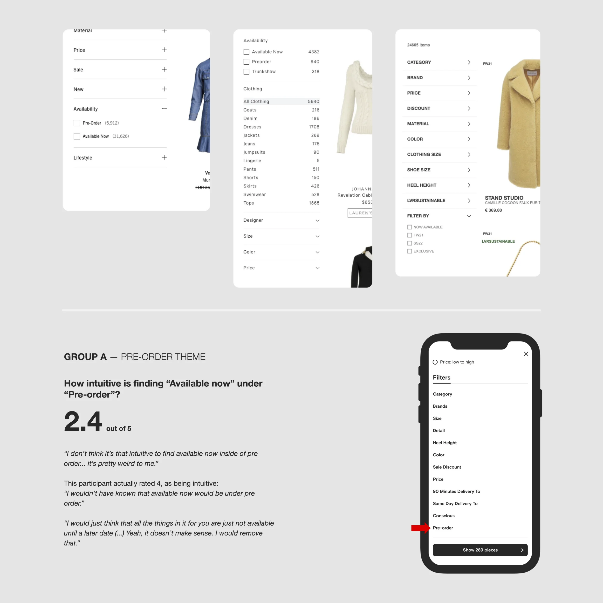
It also helps me validate initial assumptions, weed out personal bias, be more inclusive, and get to test with real users. It’s eye-opening. It allows me to refine and optimize designs, build a solid user experience, and drive satisfaction.
An early data view of the users is crucial. Allows me to get vital information on how we can succeed without going blindly and prematurely into a solution. With enough early research, we can create an execution plan aligning with business goals and motivating stakeholders.
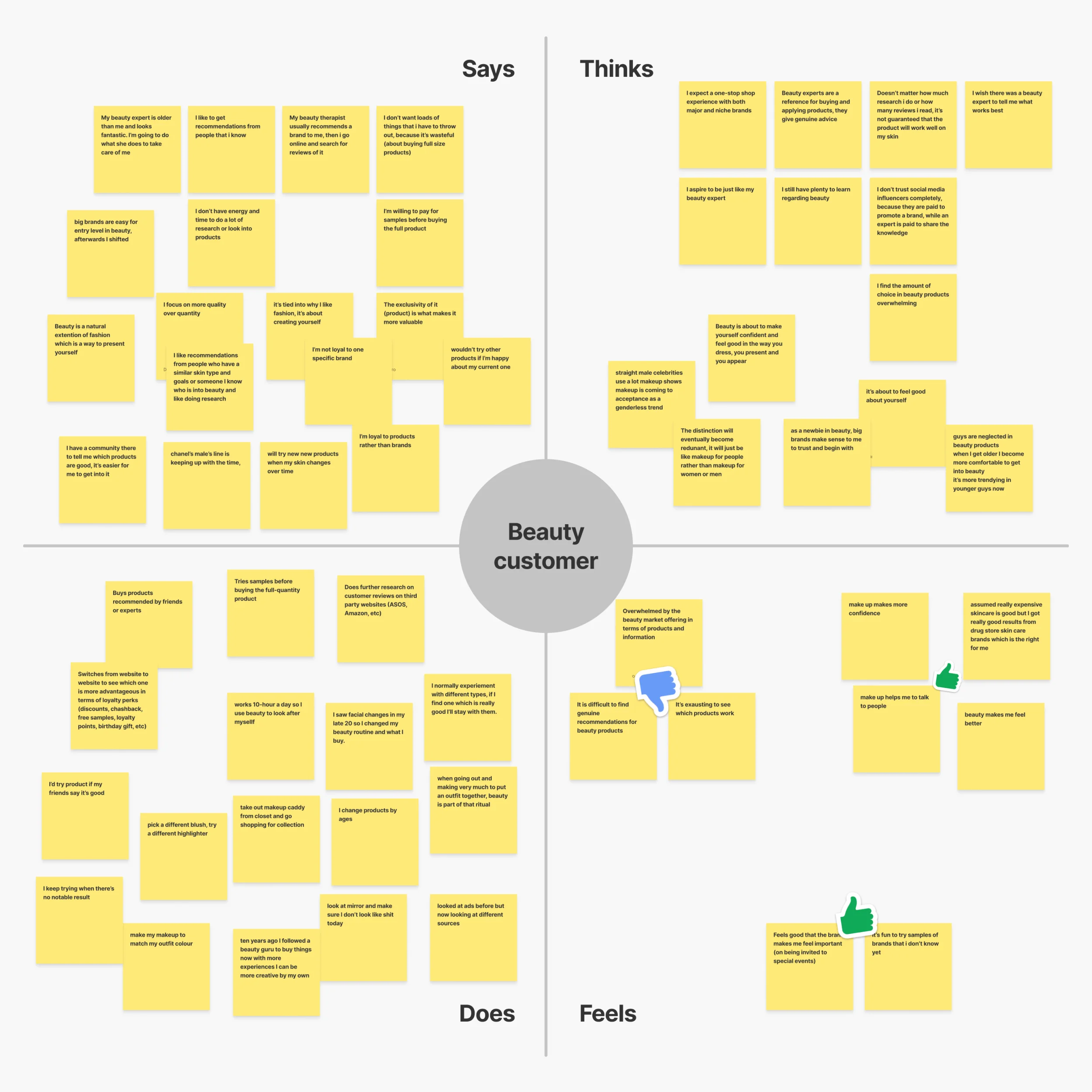
I think keeping straightforward communication throughout the design process is also essential. Leaving an open channel, transparent documentation, and inviting as many business partners as possible to review what we are building.
In my view, it’s essential to build that working group. People that understand the problems we’re facing and then co-own the same vision for what we’re doing. It allows for a shared understanding and a more collaborative process around those business goals.
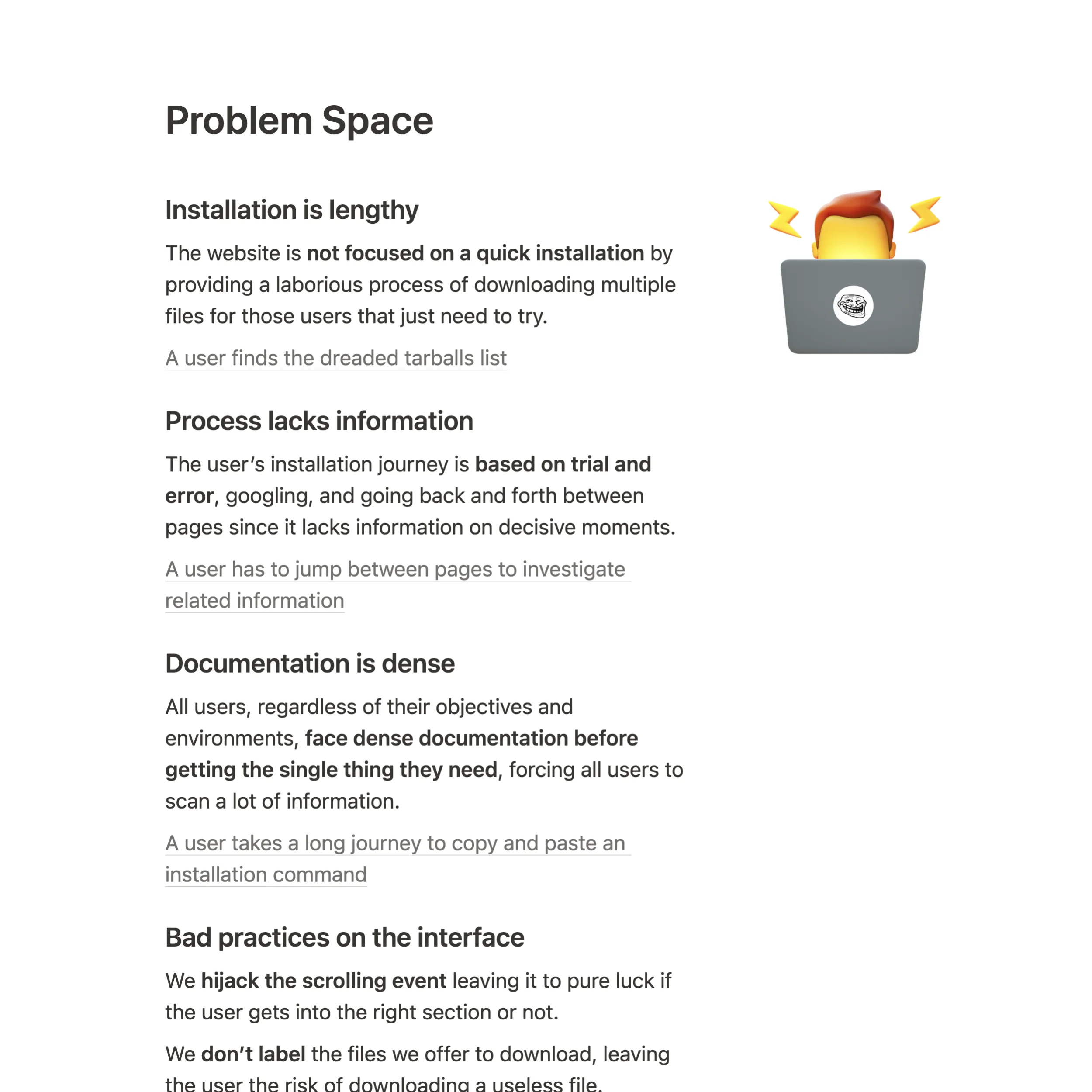
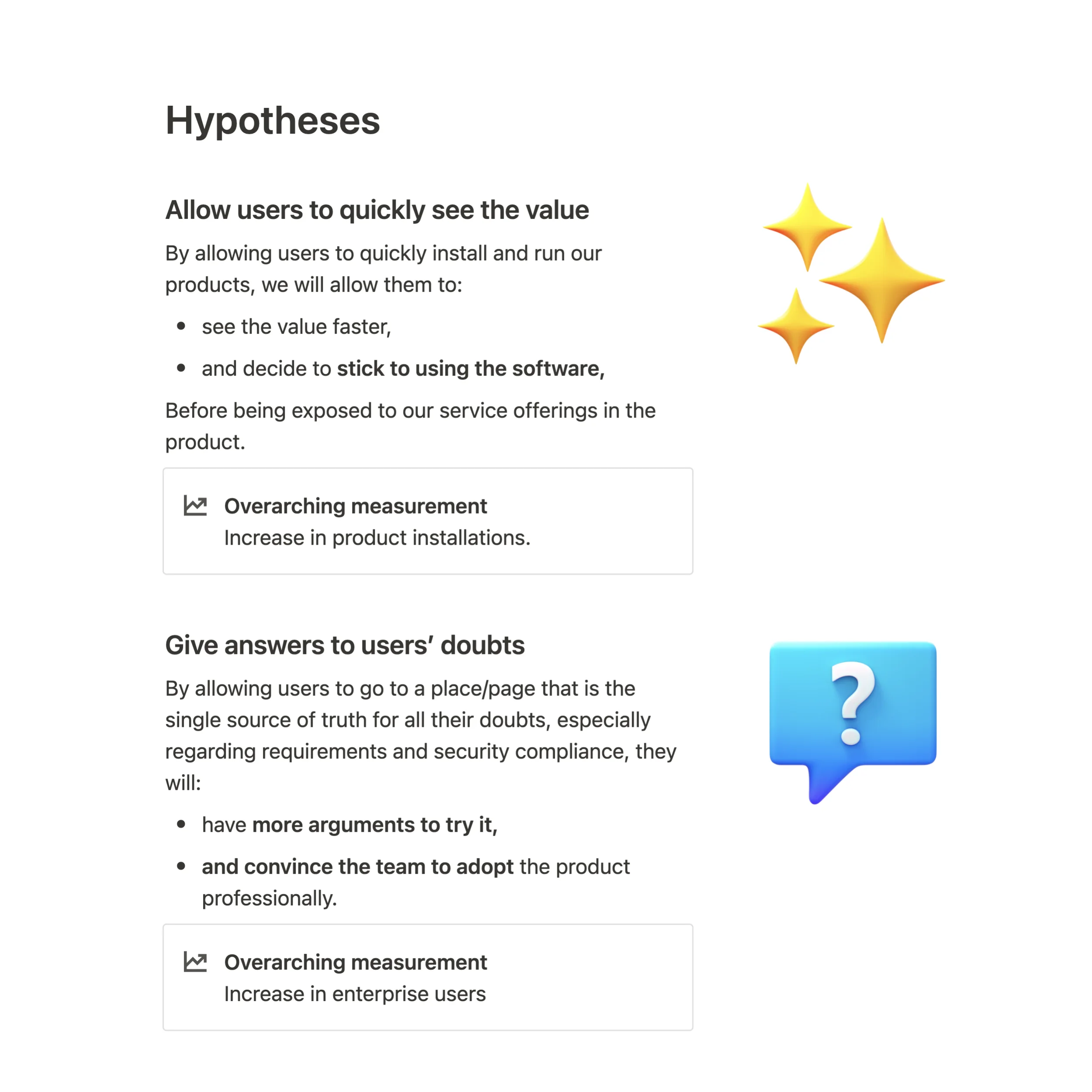
This process is crucial because I don’t believe in generic business goals that come out of thin air. For a successful user-centered product, at least a good foundation of user research is needed to inform and break down those goals into something more tangible.
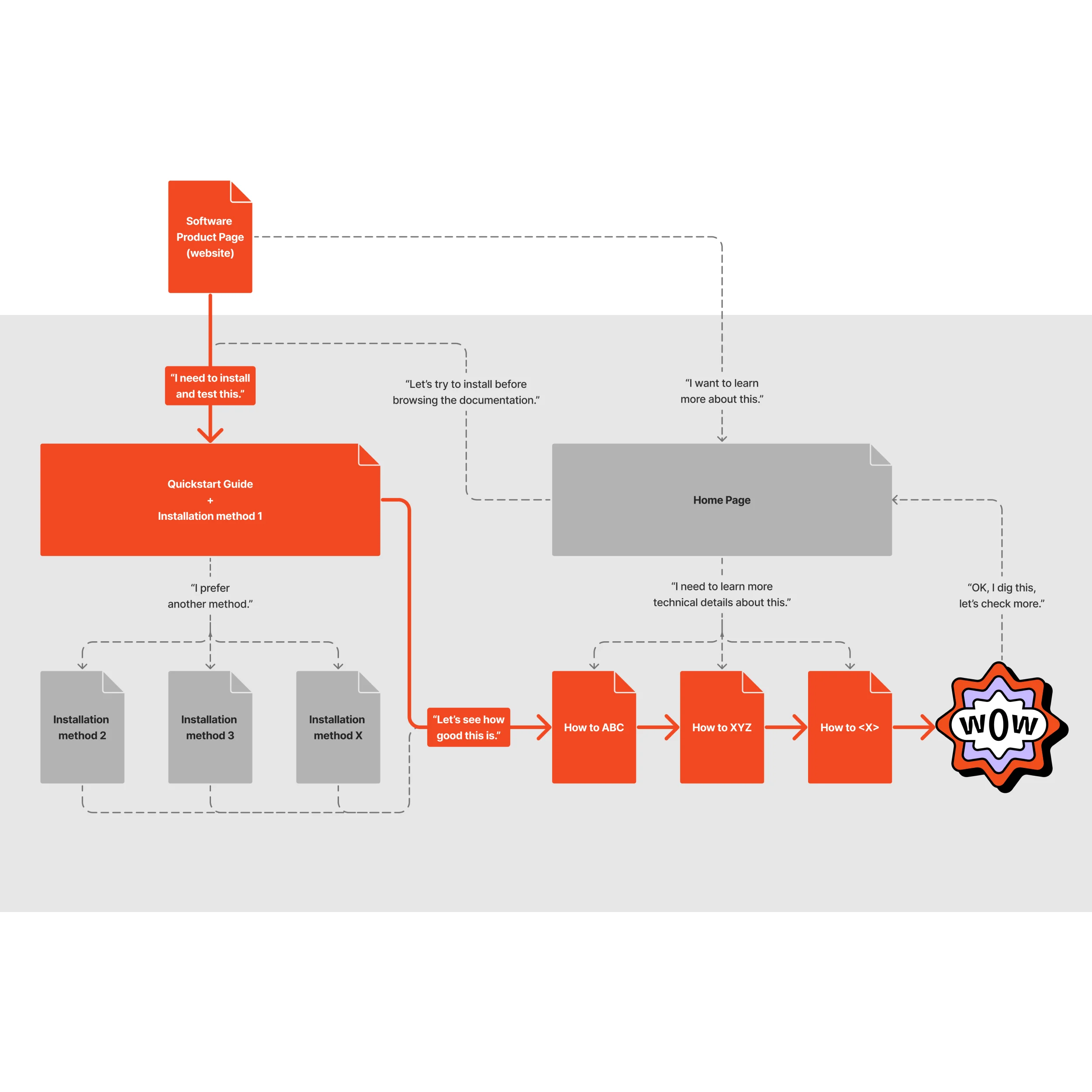
It depends on speed and accuracy. Usually, I decide on using the design tool we have at hand. Almost any tool works, really. Especially if we’re OK with a wireframe-style prototype, even a sketch on paper will suffice. Whatever can get us, as a collective, into feedback and some data, fast.
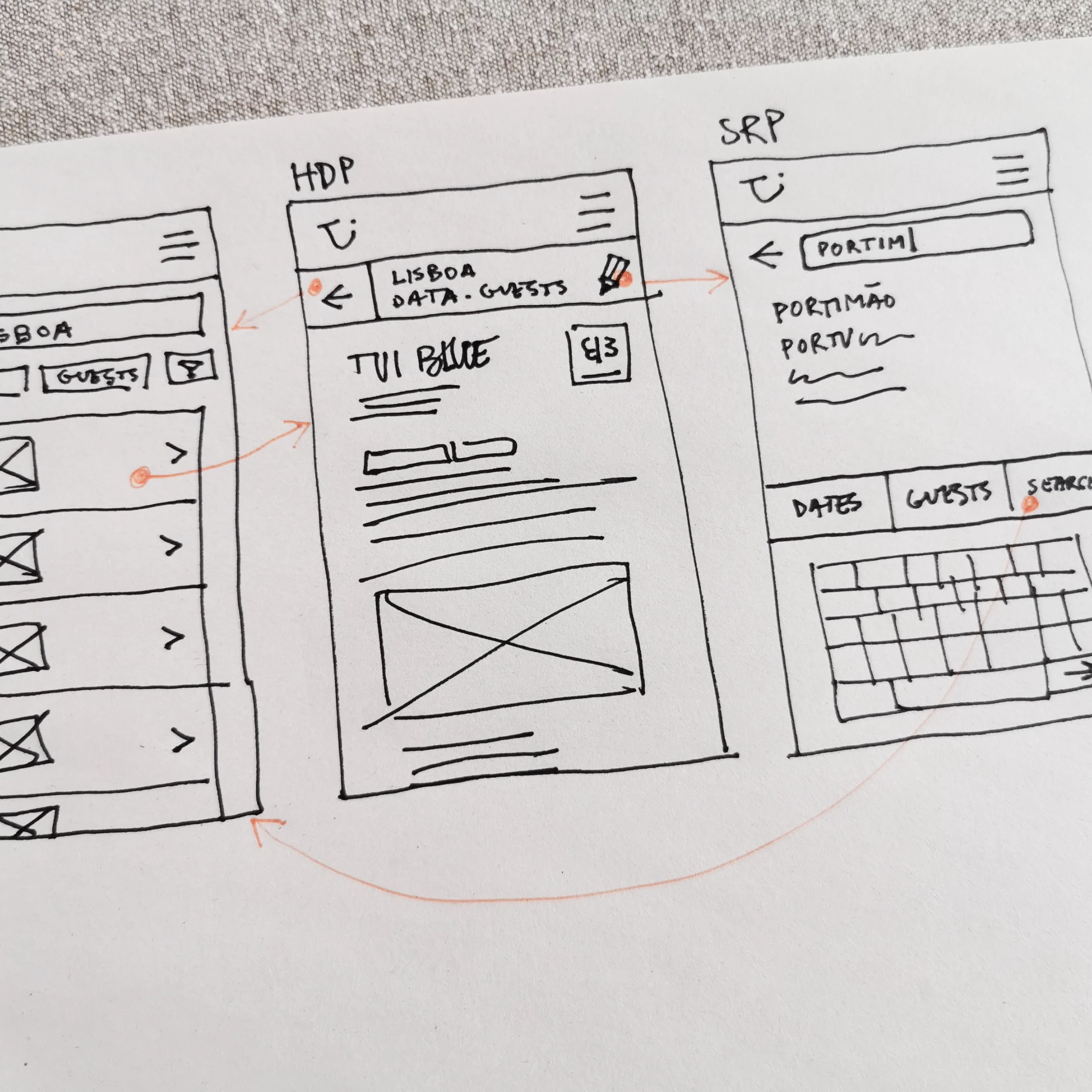
Code prototypes are more accurate, however. Implementing them can take longer, but it’s perfect for more complex problems. A code prototype with a wide array of interactivity will output high-quality data when testing and is helpful, in the long run, to ship faster.
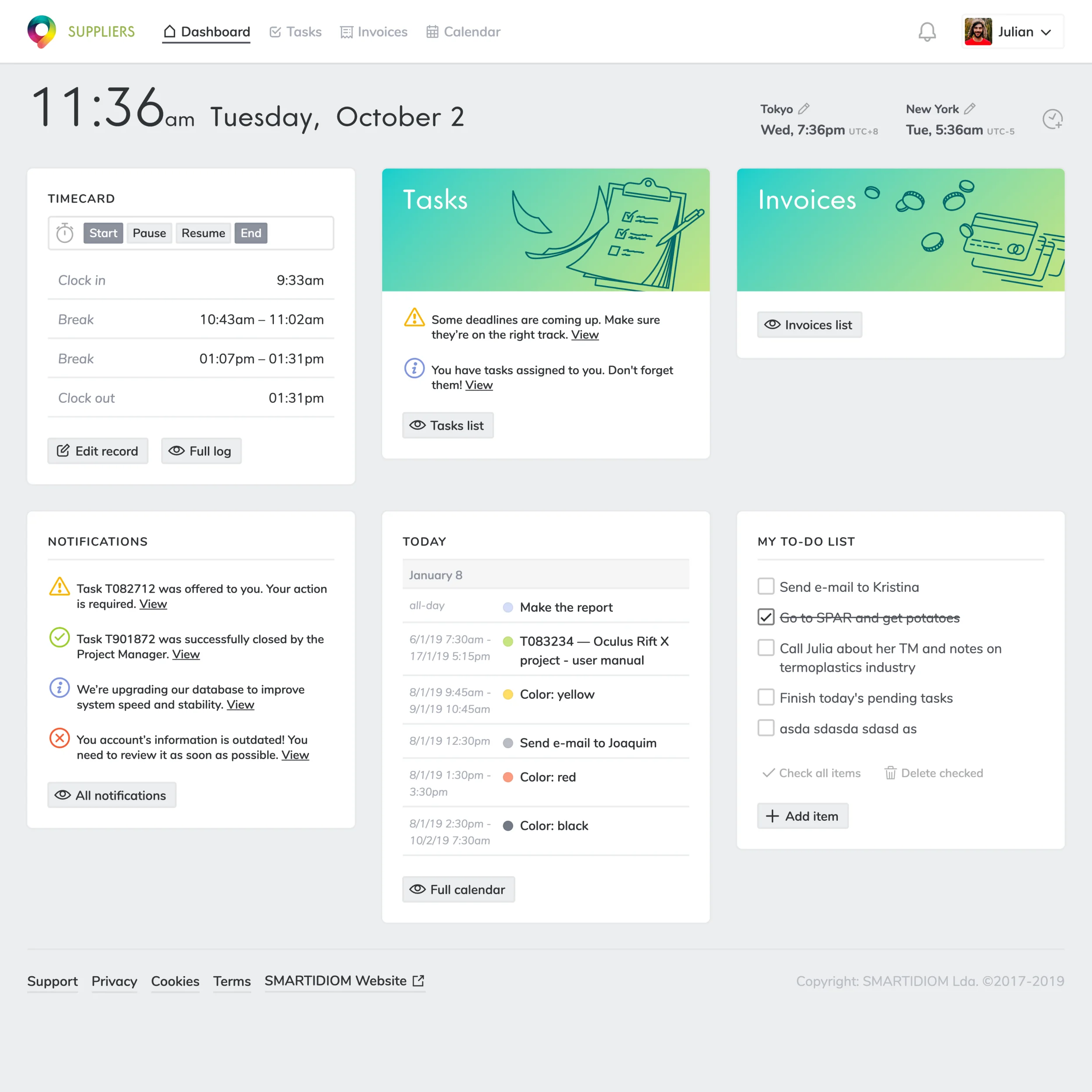
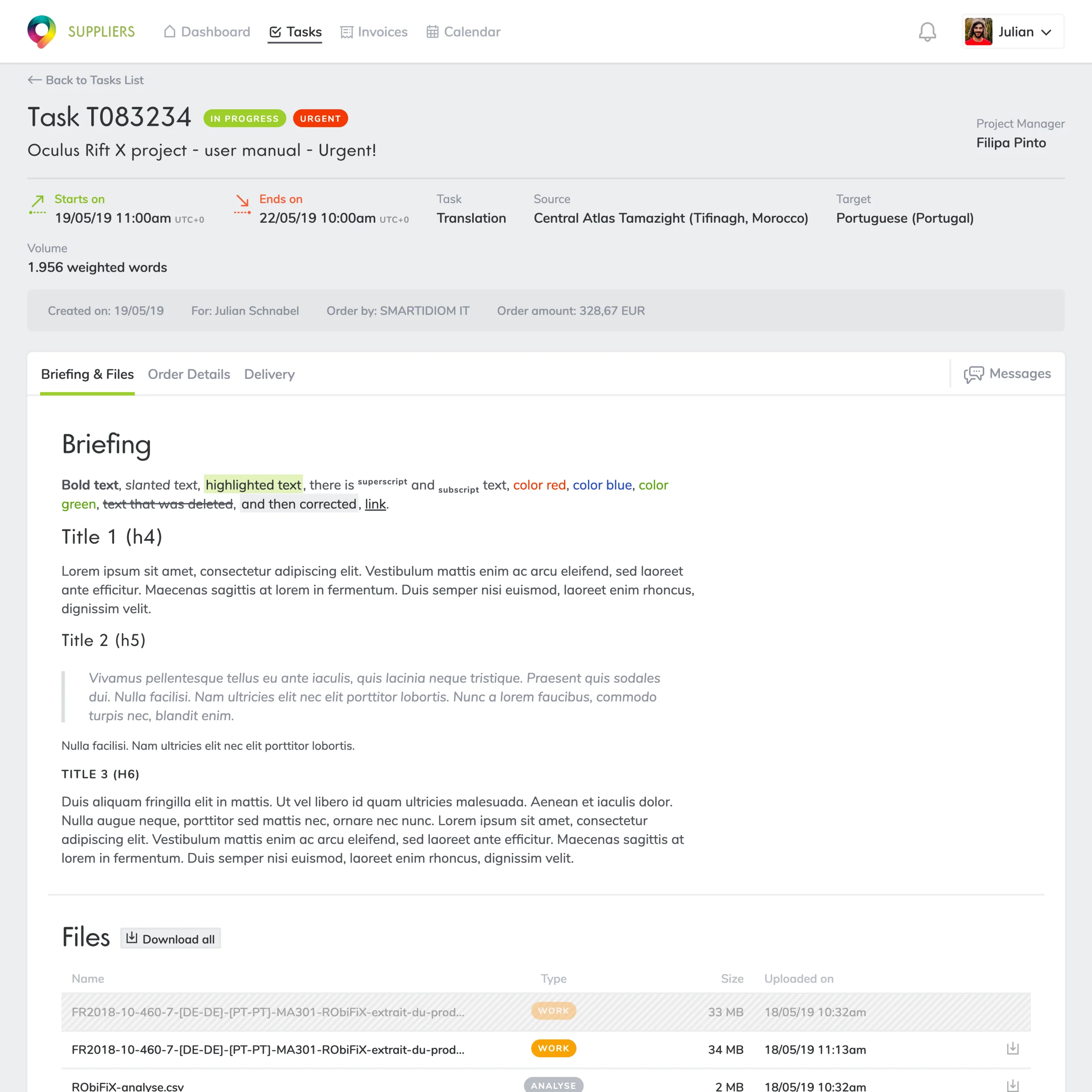
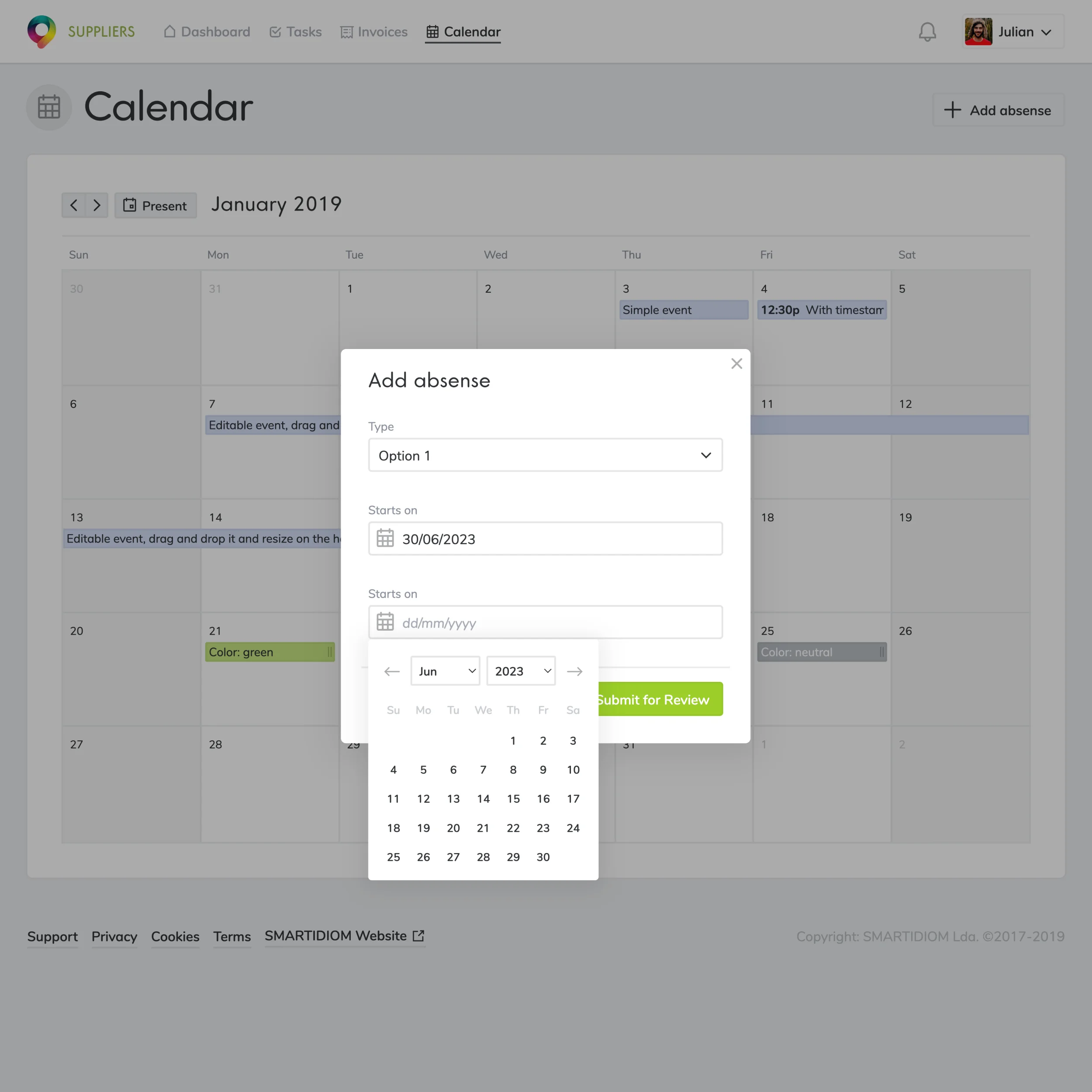
While getting these prototype artifacts out, I usually set up collaborative sessions within the team or with some internal guerilla tests. This way, I can gather diversified views on the materialization of the solution.
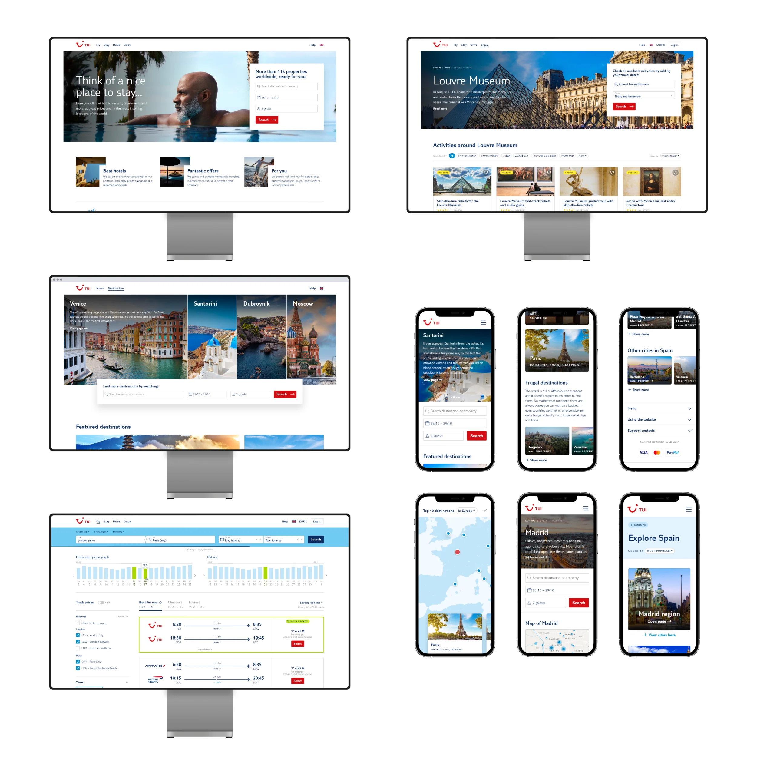
Iterating involves incorporating collected decisions into a new version of the designs and then having mechanisms to share that again with the team quickly. We can use that new version even for subsequent rounds of testing or, if we’re already confident, directly to implementation handoff.
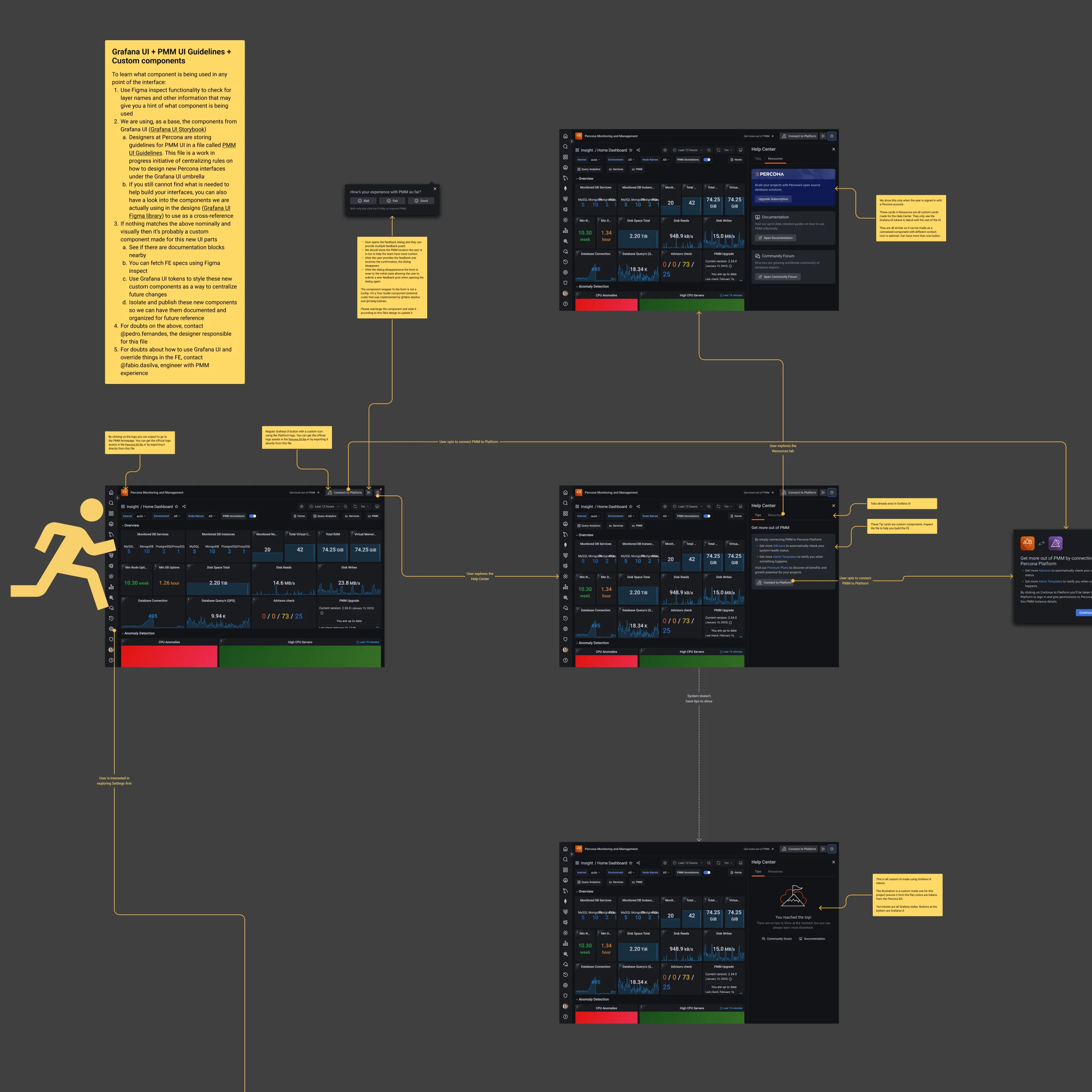
If we want to go fast, I go with internal testing. Valuable input can be obtained from specialists, engineers, customer-centric positions, and fellow designers, resulting in a diverse perspective that can steer the initiative in a positive direction.
We can also get paid users to test information architecture with tree testing and card sorting and quickly test interfaces with wireframes and fast, rough prototypes. This will help validate assumptions I may come up with and shape the final solution.
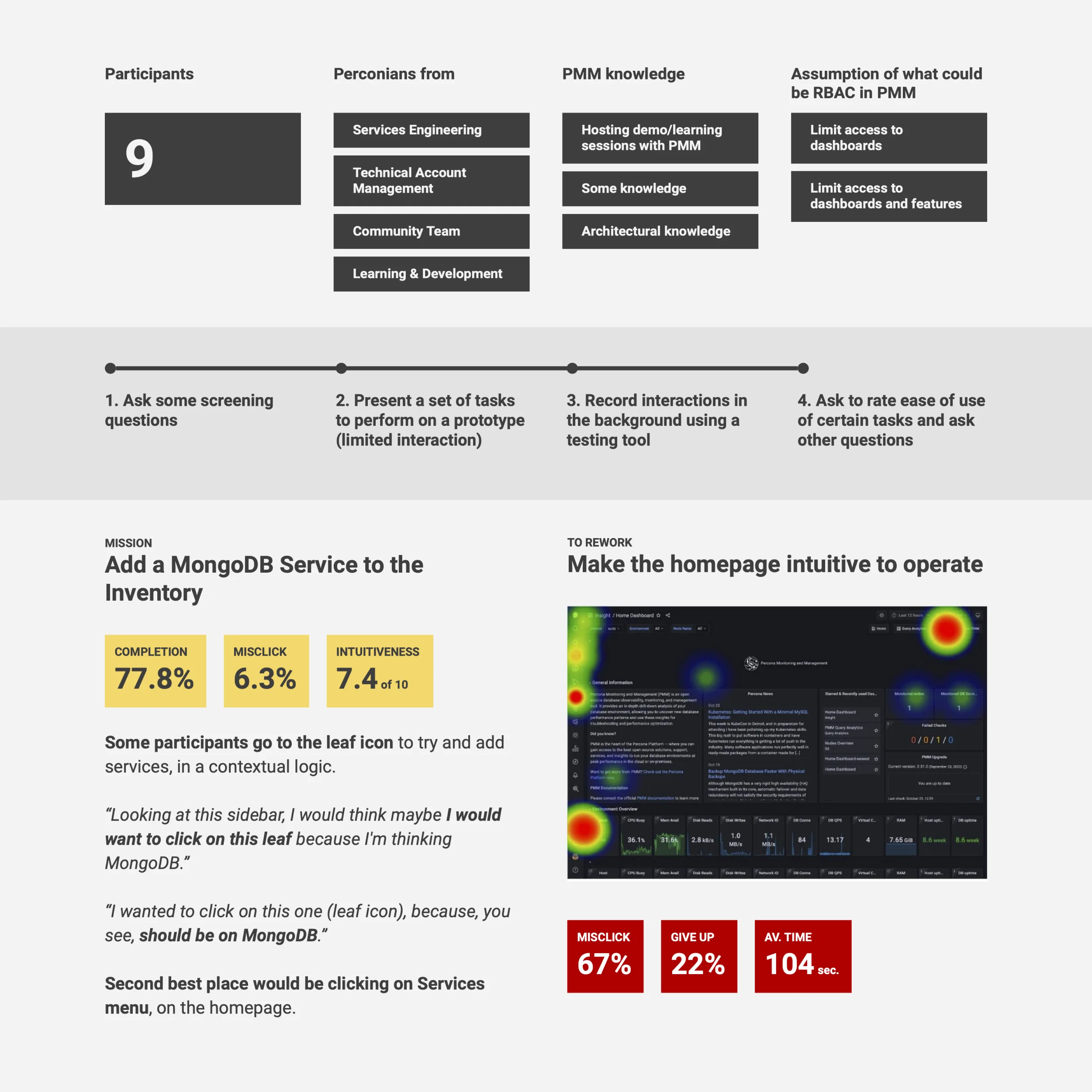
However, I prefer solid, more complete user testing to extract more data and mature ideas properly. The best would be to pick customers to improve the product through interviews or meticulously screened users to test features or whole products.
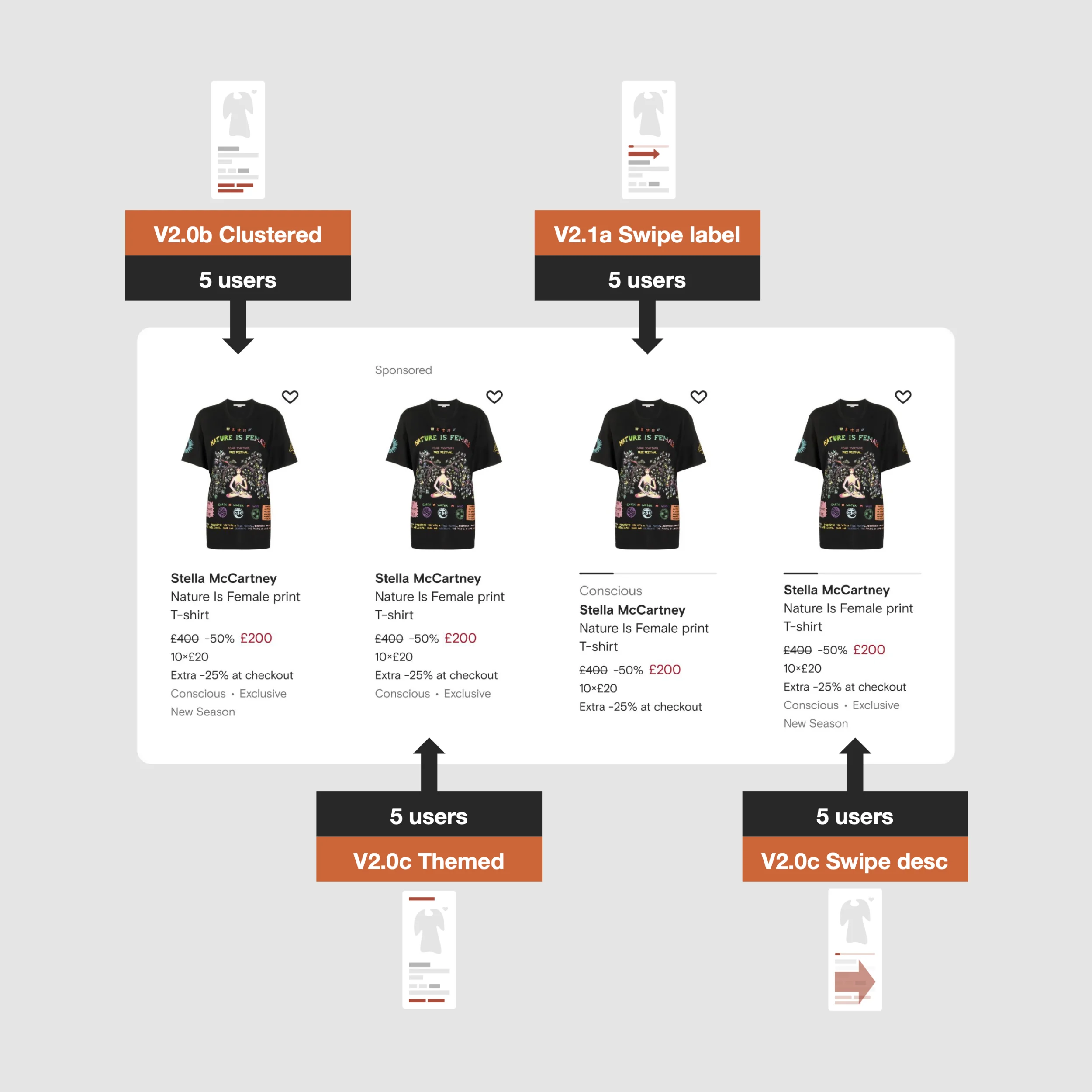
When an idea grows, I seek to fine-tune it with usability and multi-variant tests. Whatever technique we adopt, the direction is doing so to meet the users’ and customers’ needs and expectations, and we need to validate that compatibility before committing to code complex solutions.
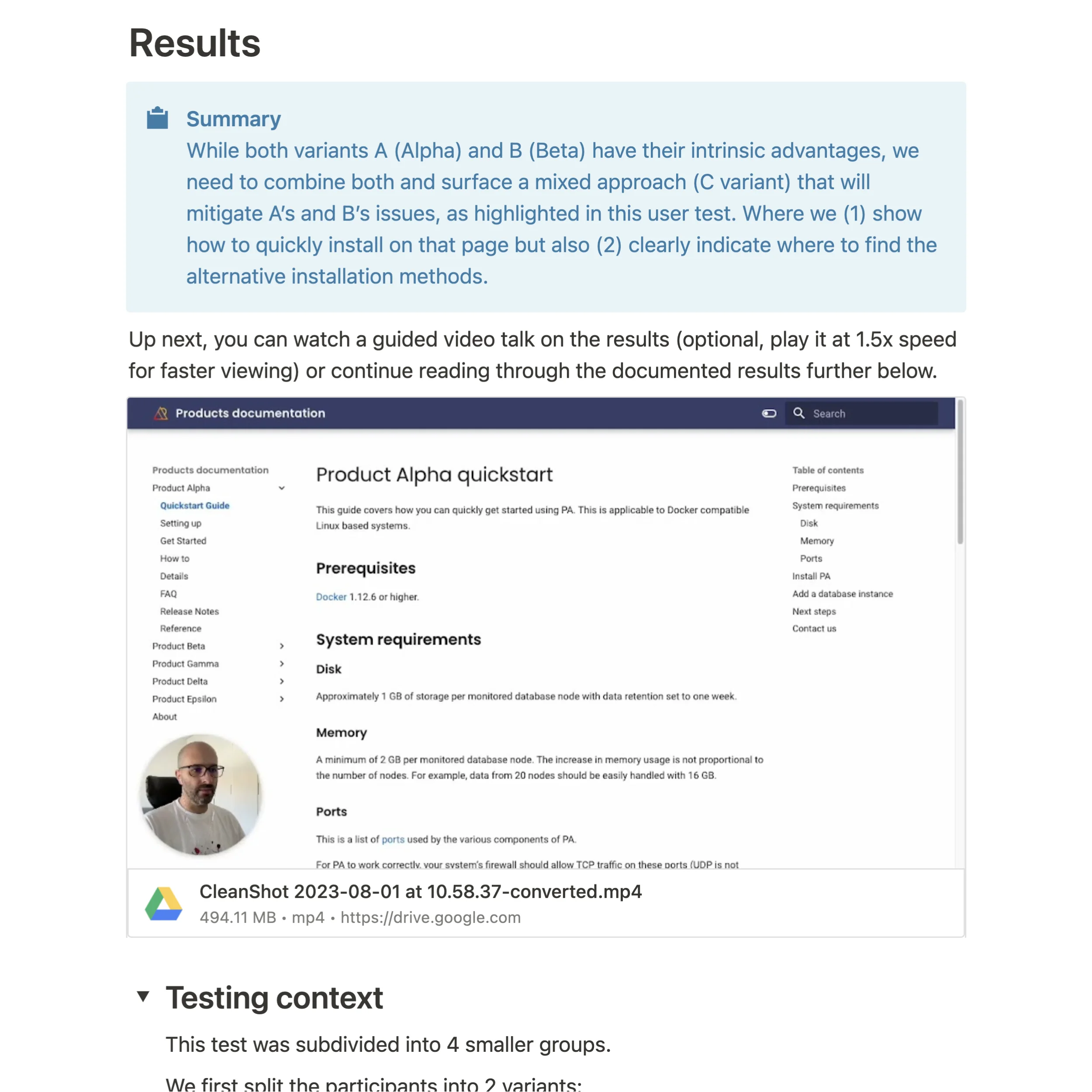
Communication is critical, so I get to know everyone first and expose what I do as a product designer. I suggest we set up open communication channels to push updates and exchange feedback or new intel about users and customers.
This is important when a design team is new in the company or even when a new initiative starts. Having documentation ready for this is also very important, so I condense all relevant information so everyone can get onboarded async on how design can help.
Involving the team and hosting collaborative sessions is also helpful. It’s a more inclusive approach that helps everyone be hands-on, motivated, and see the value in user-centered solutions.
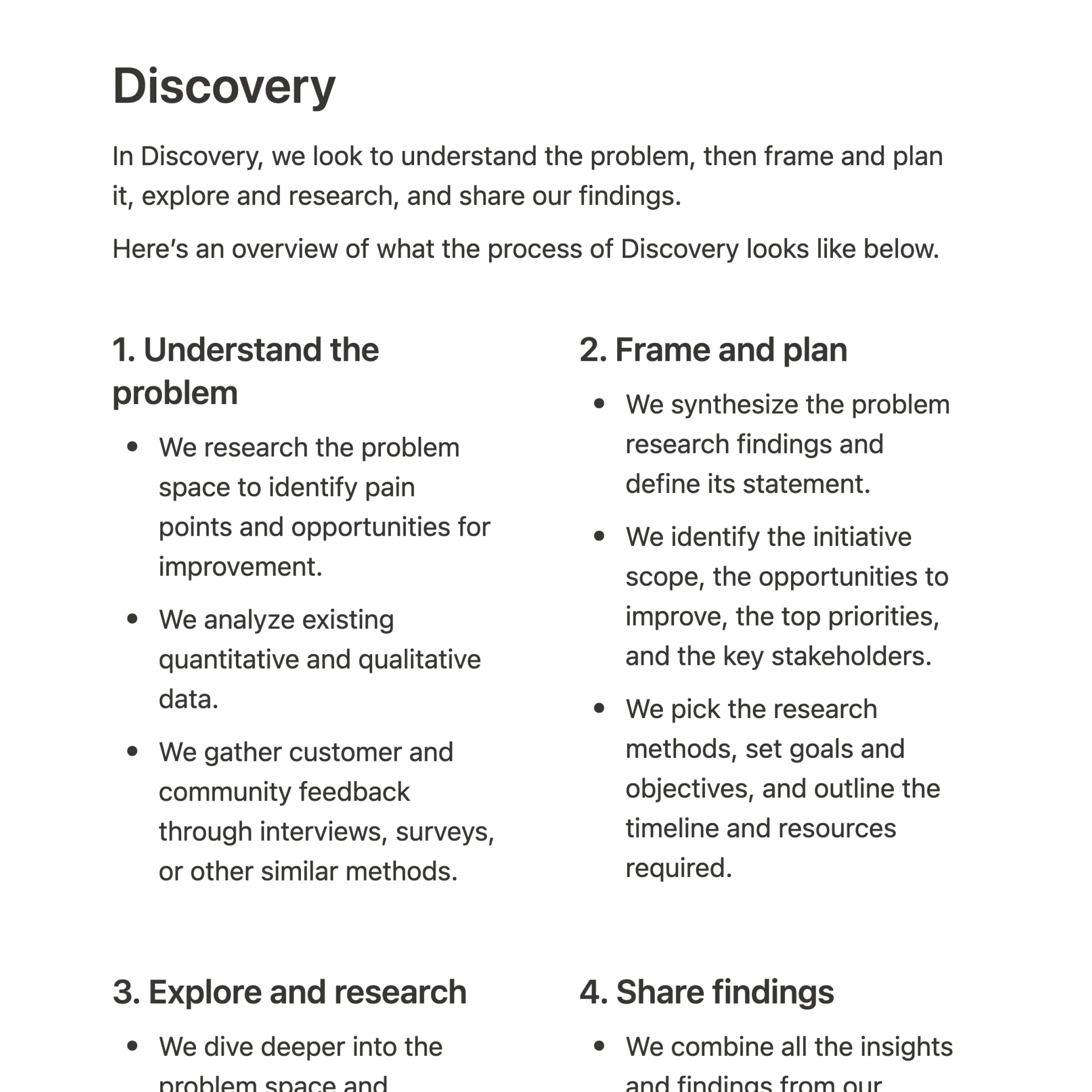

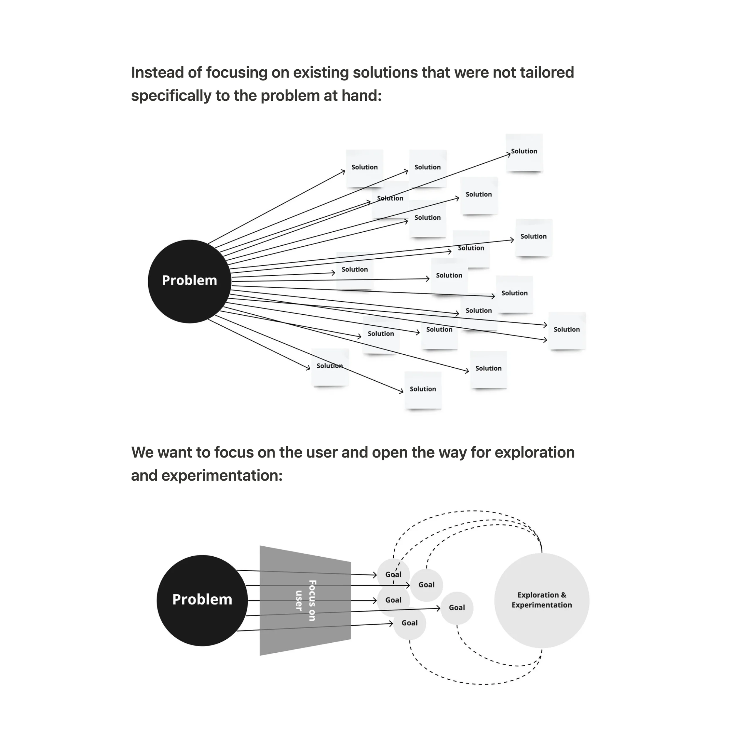
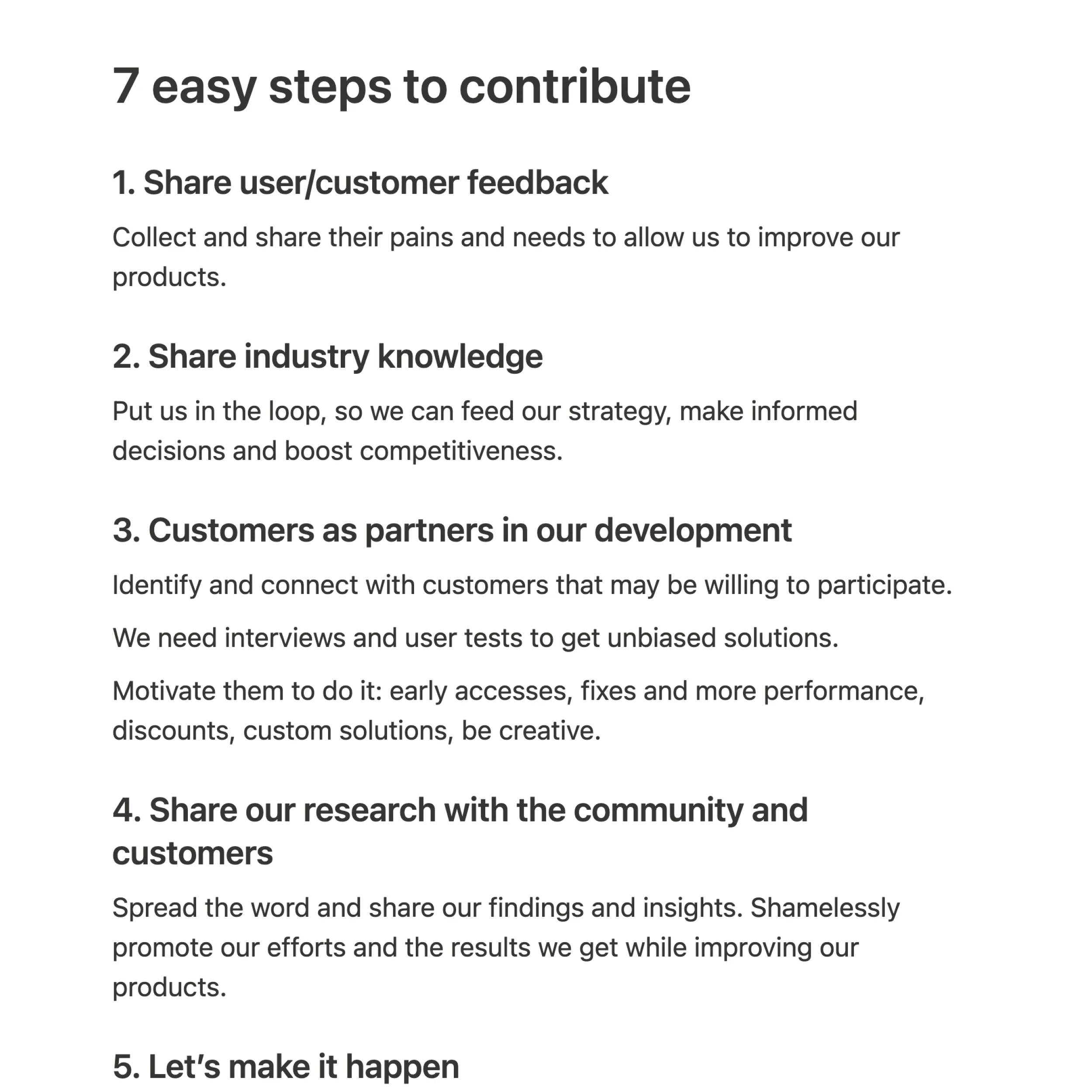
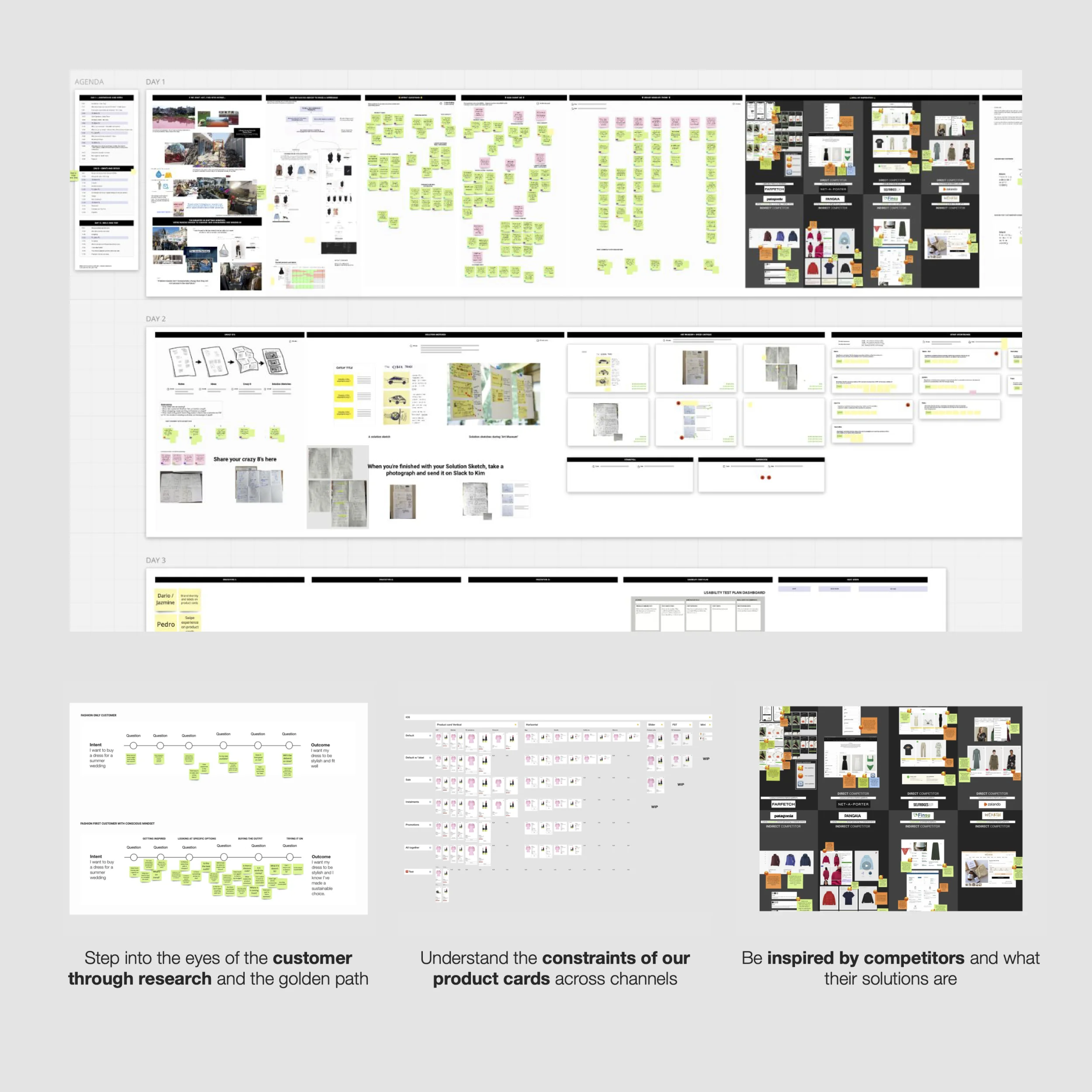
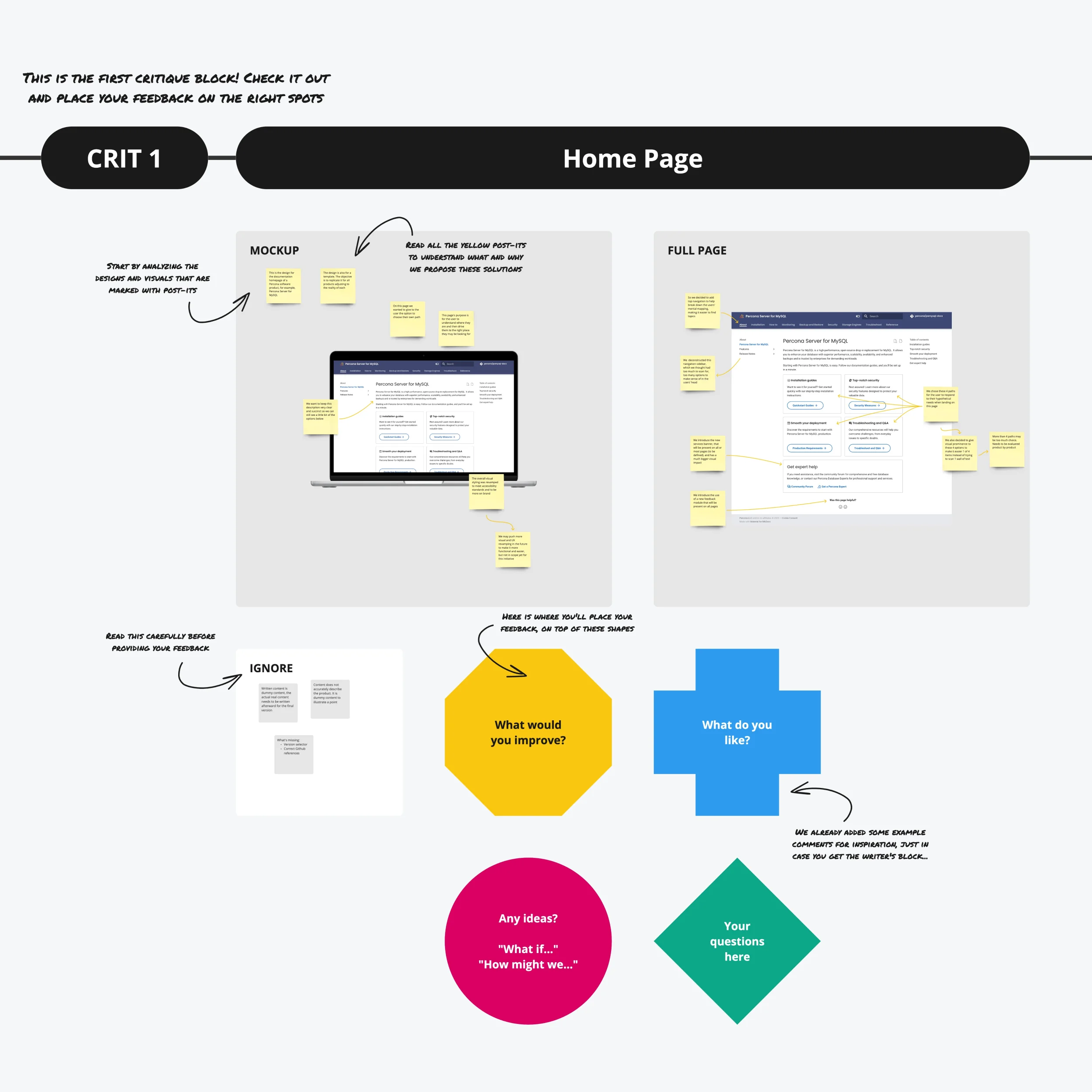
There’s a lot to choose from. User feedback and testing are critical to understanding if the solution aligns with users’ needs and mitigates their problems. Usability metrics like completion/error rate can show us where to fine-tune.
Interviews and surveys with users and customers are also vital for me to get their perception and level of satisfaction. While we can assess product acceptance, it also helps us understand improvement areas.
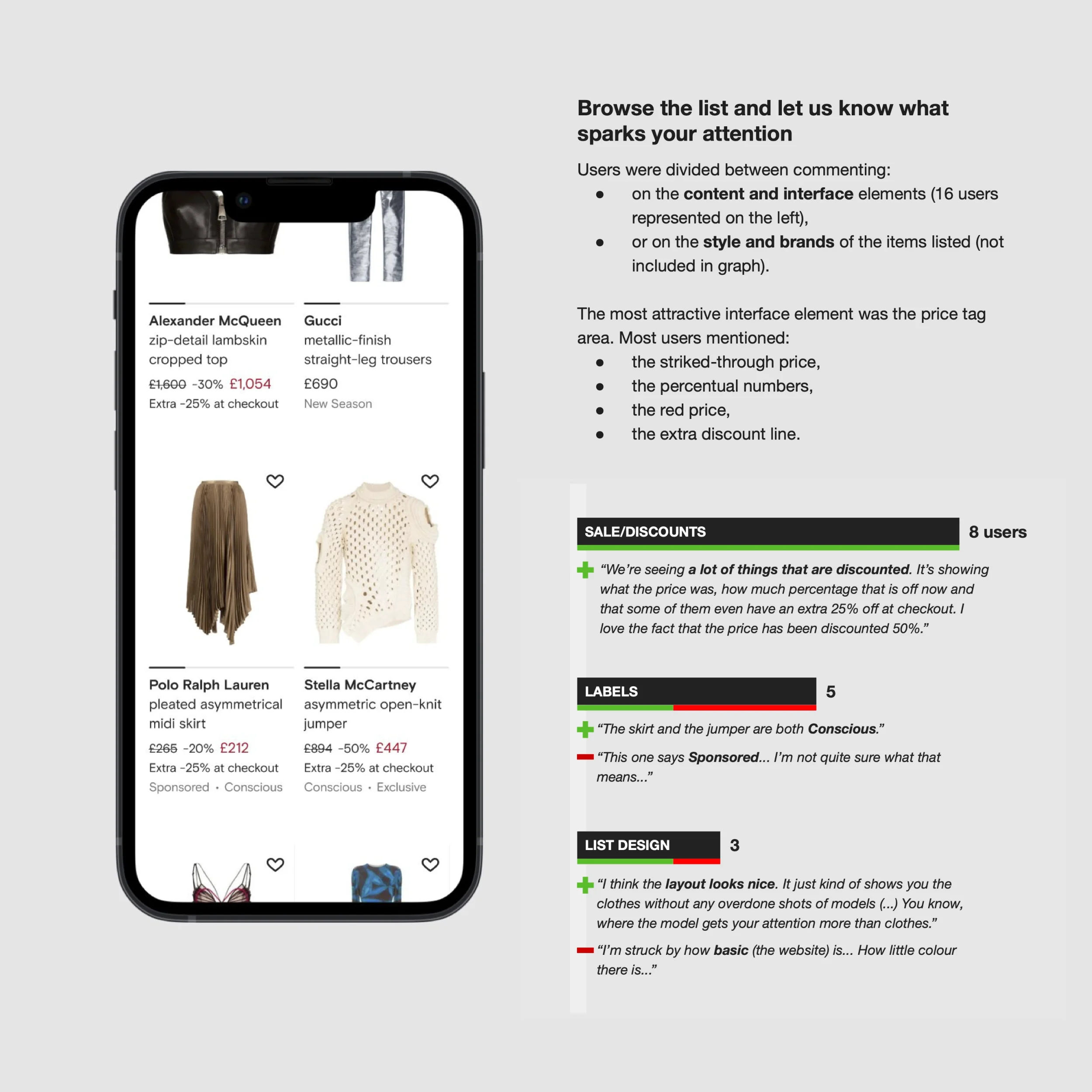
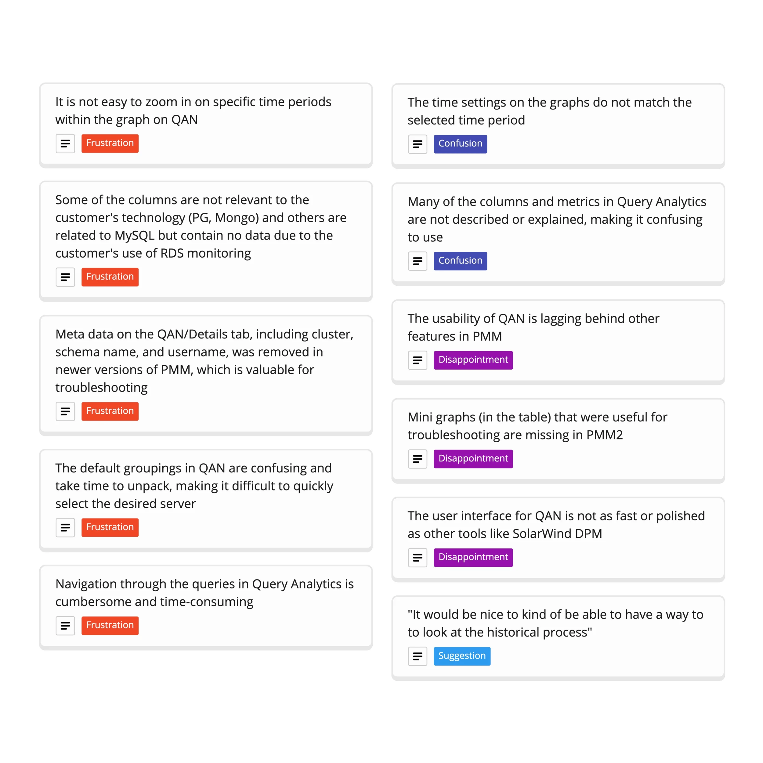
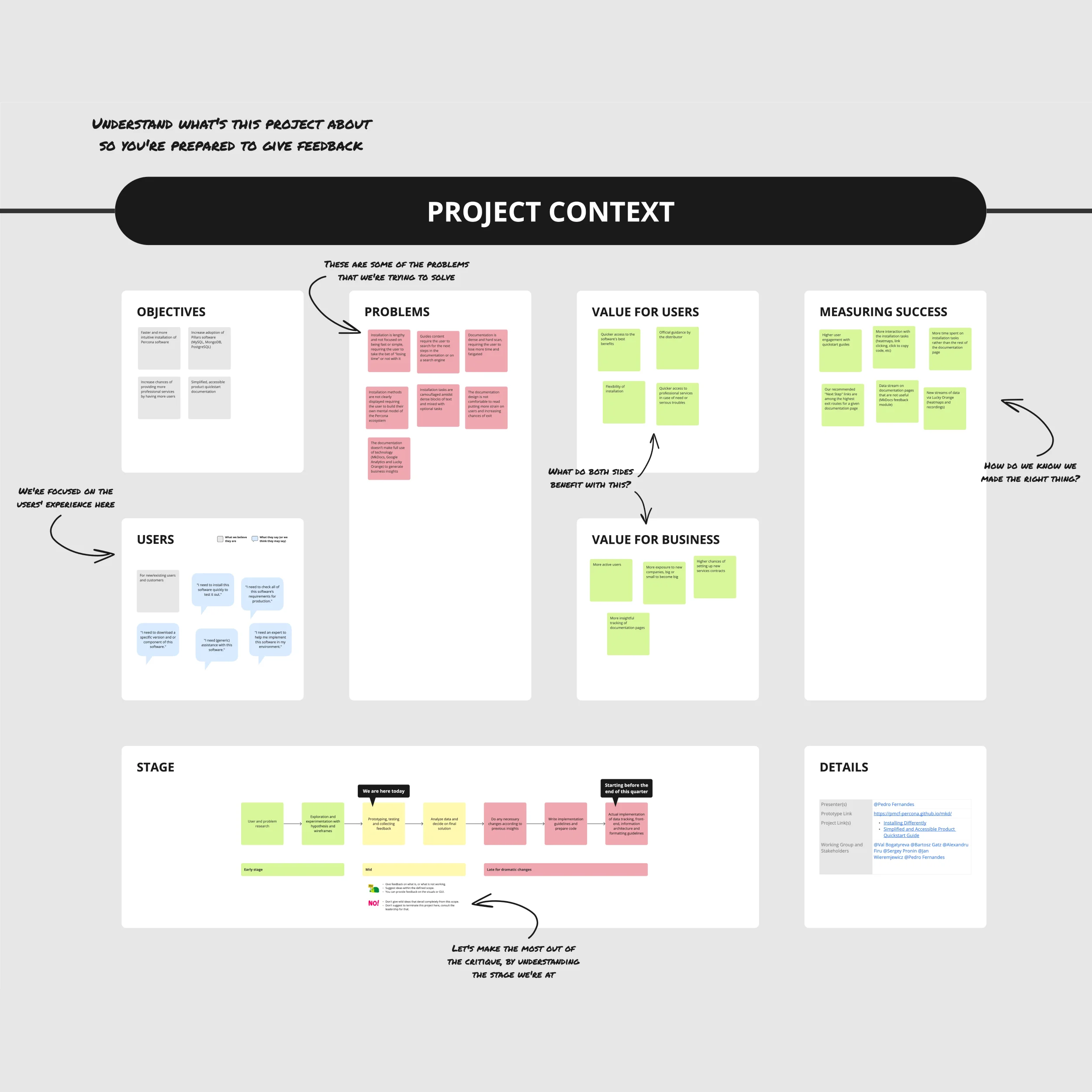
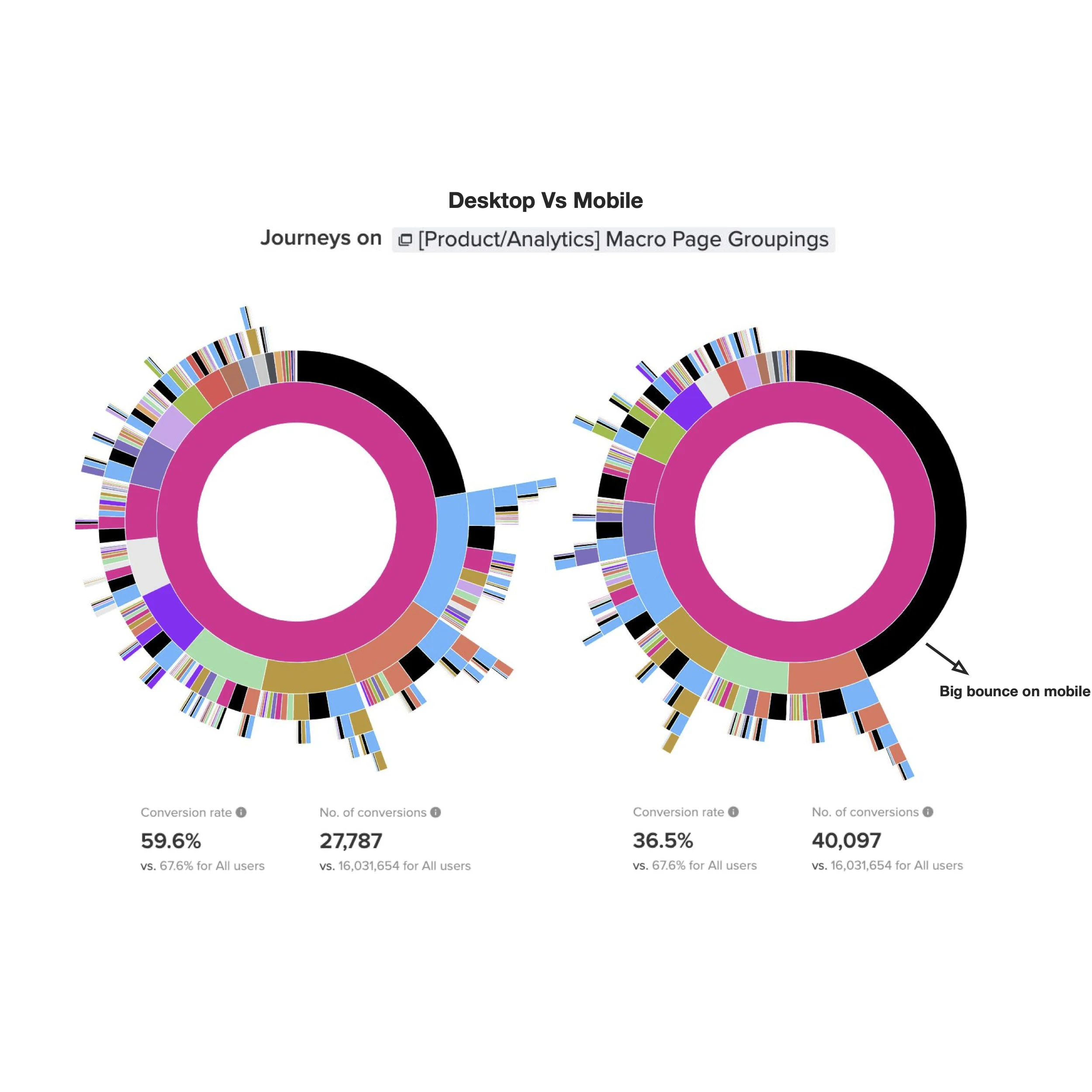
I value design and aim to obtain pertinent metrics to evaluate its impact. This may include KPIs such as conversion rates, user engagement, and revenue. Benchmarks can also provide valuable insights into our standing compared to others and measure our transformation through design.
Having a well-documented or transparent iterative approach to the design process is also essential so everyone can see the mutation of a solution. This way, everyone can understand the value and the effort put into the operation.
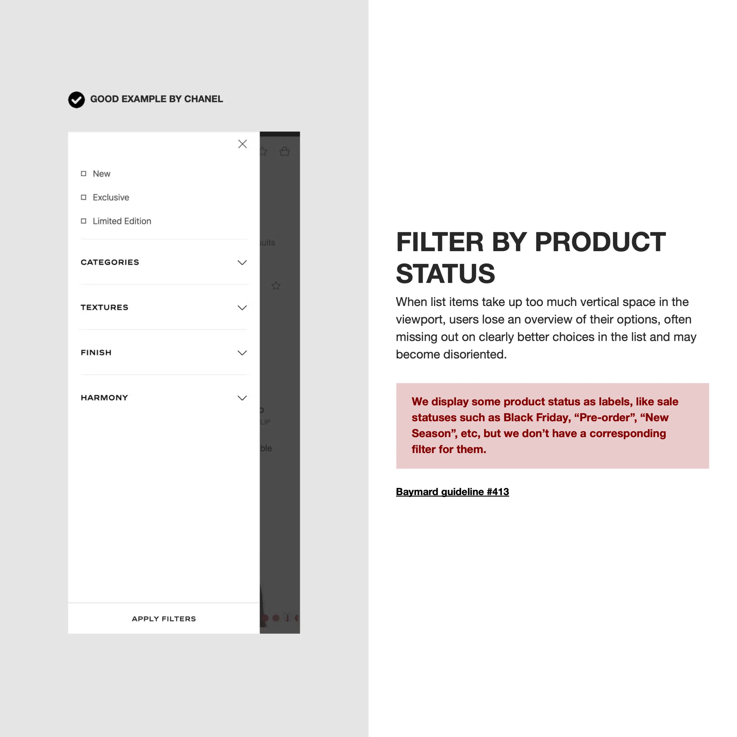

I aim to ensure everyone can enjoy life, regardless of their abilities, disabilities, or unique needs. The best I can do is to be mindful of their experiences and infuse inclusive design principles into my work.
During user research, I make it a point to engage with individuals from diverse cultural backgrounds and age groups while including underrepresented groups to ensure a fair and balanced assessment.
One thing here I think I need to improve is collaborating with experts in accessibility and inclusivity to get insights and feedback on my designs. And I also need to educate myself more, infuse this knowledge into my process, and share it with the team.
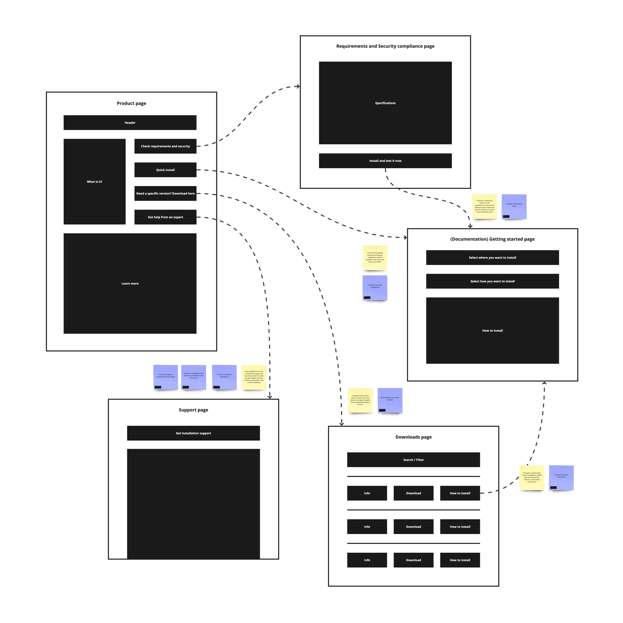
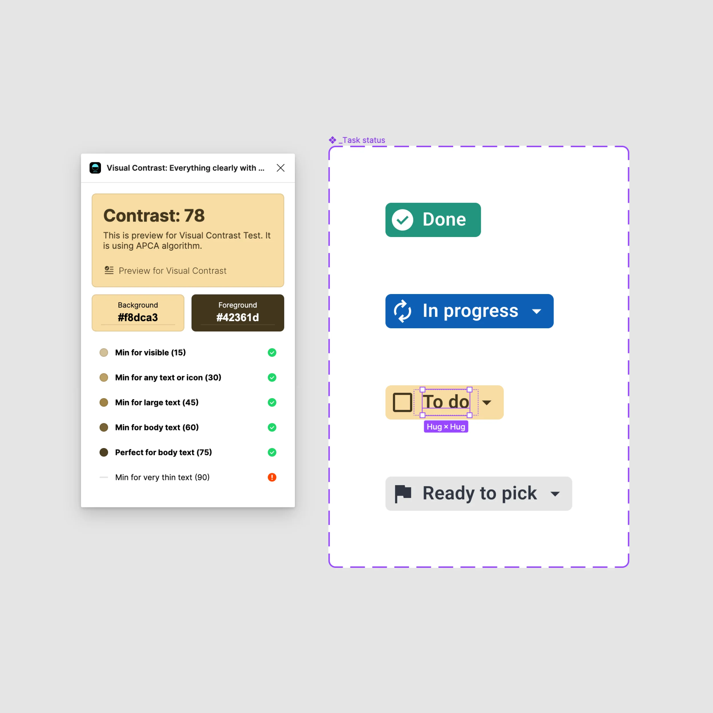
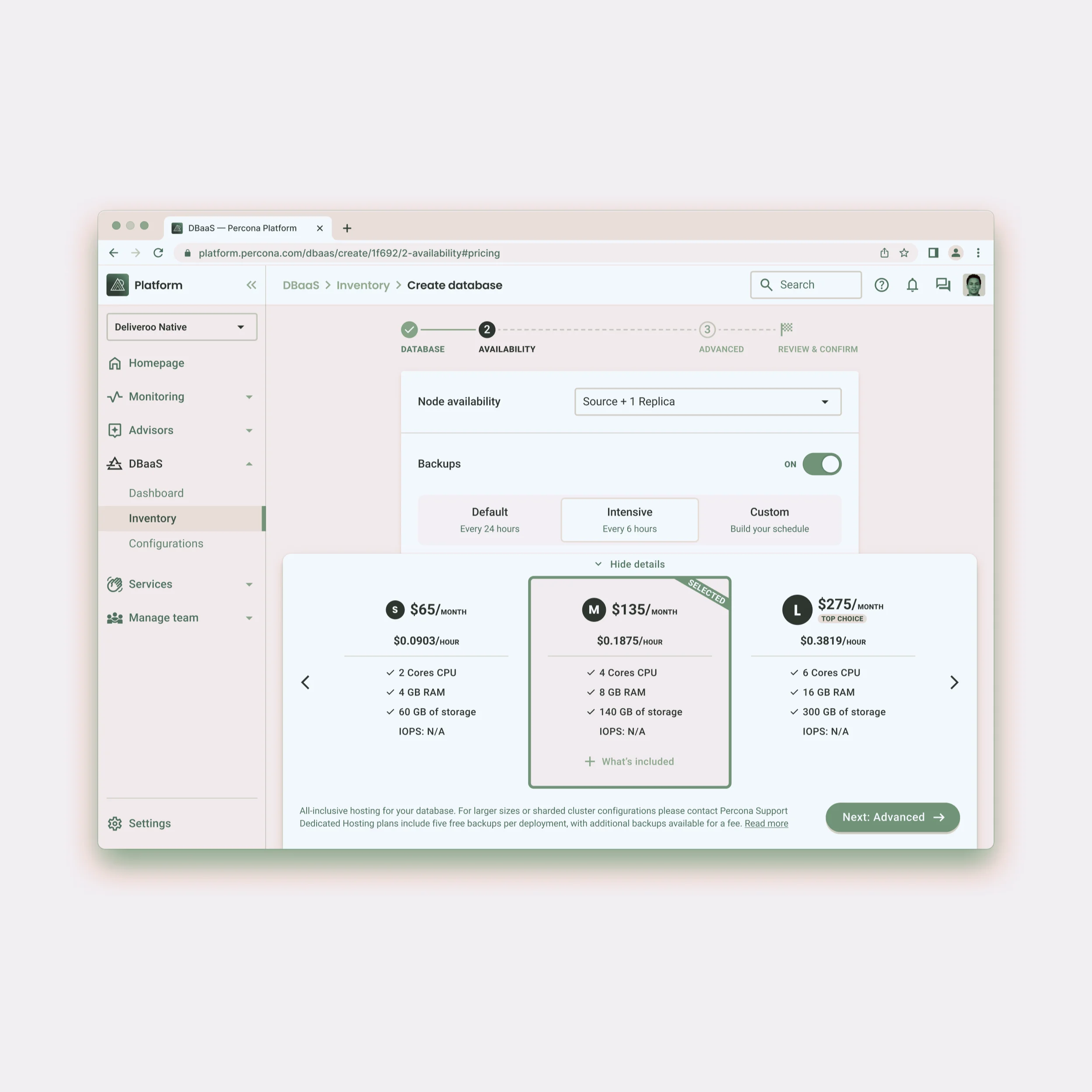
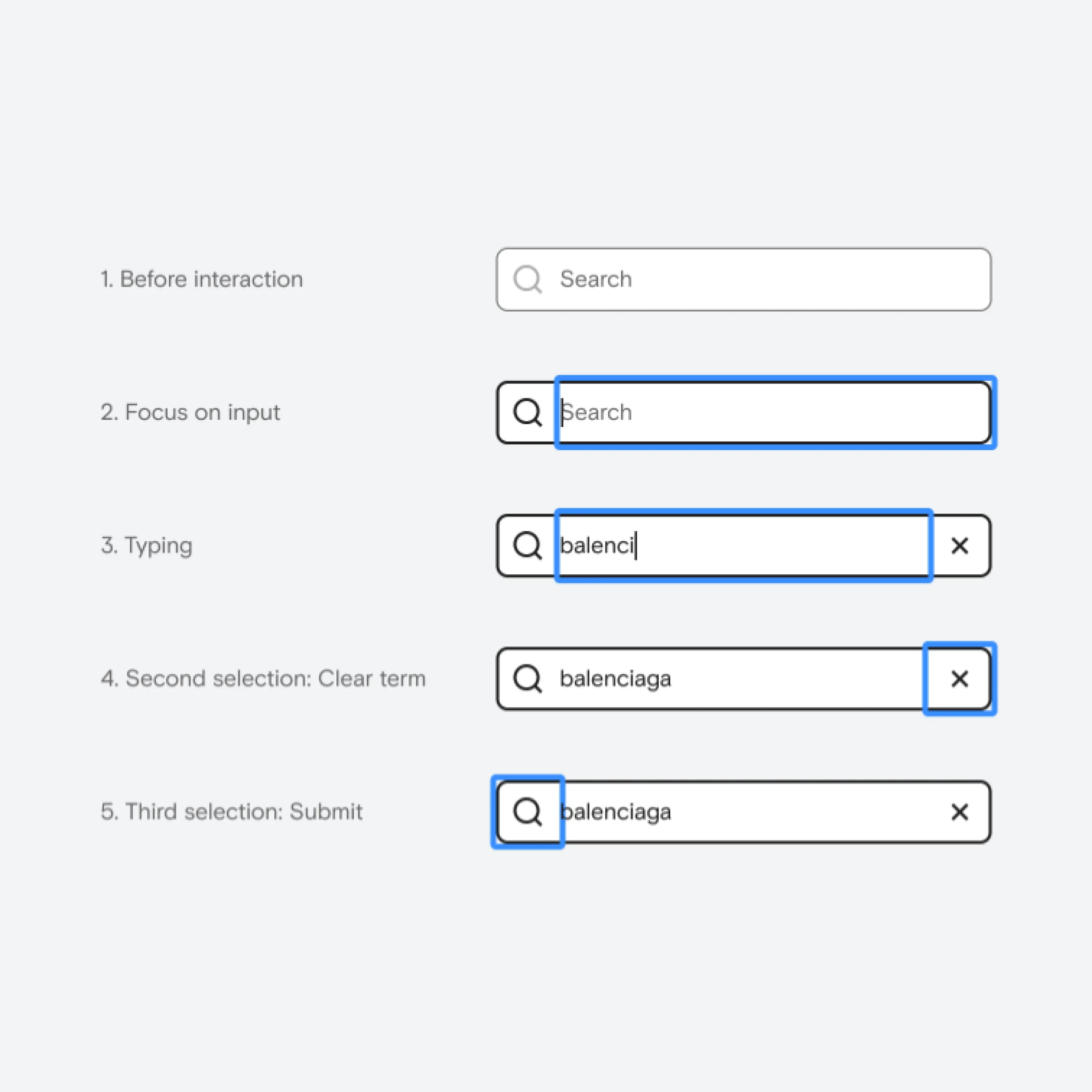
I follow established guidelines like WCAG to ensure my designs meet accessibility standards. I mainly consider how hierarchy and color are perceived, how effective the keyboard is on the app and overall compatibility with assistive technologies.
Welcome! I’m Pedro, and this is my website, where I show myself as a product designer.
To pan around, try
To zoom in and out
You can also use your keyboard! To pan, use the directional keys ← ↑ → ↓ to zoom, use the plus + and minus - keys.
Thank you for your visit ♡